A growing library of .pbiviz files — gauges, KPI cards, bullet charts, heatmaps, and more. One-click import into any Power BI report.
19 visuals available

The Briqlab KPI Card is a beautifully designed Power BI KPI card that turns a single measure into a compact, high-impact tile. It pairs a primary metric value with a comparison metric, a colour-coded trend arrow, and a descriptive label, so the most important number on your report reads clearly at a glance. Large values auto-format to K or M, and an animated pop effect highlights the moment the value changes, keeping attention on what matters. Key Features - Primary KPI value with automatic K and M formatting for large numbers - Comparison metric to show performance against a prior period or benchmark - Trend indicator arrow (up or down) with colour-coded performance - Descriptive text label beneath the value for instant context - Animated pop effect that highlights changes on data refresh - Configurable font size, primary colour, and background colour - Adjustable border and corner radius to match any report theme - Single compact tile that drops cleanly into summary layouts Top Use Cases The KPI Card is built for executive summary pages where leadership needs the headline number first and detail second. Finance teams use it across financial dashboards to surface revenue, margin, and cash positions with a clear delta versus plan. Sales organisations rely on it for scorecards tracking pipeline, bookings, and quota attainment. It also fits operations and marketing reports, retail performance walls, and any tile-based layout where a single metric must dominate the visual hierarchy and read instantly. Why Choose the Briqlab KPI Card The Briqlab KPI Card combines refined visual design with native Power BI behaviour. Every element, from primary colour and background to border and corner radius, is configurable in the Format pane, so the card matches your brand and theme without custom code. The trend arrow and comparison delta are colour-coded automatically, communicating direction at a glance, while the animated pop draws the eye to fresh data. Unlike generic cards, it balances density and clarity in a single tile, giving executive dashboards a consistent, premium finish that other built-in visuals cannot match.
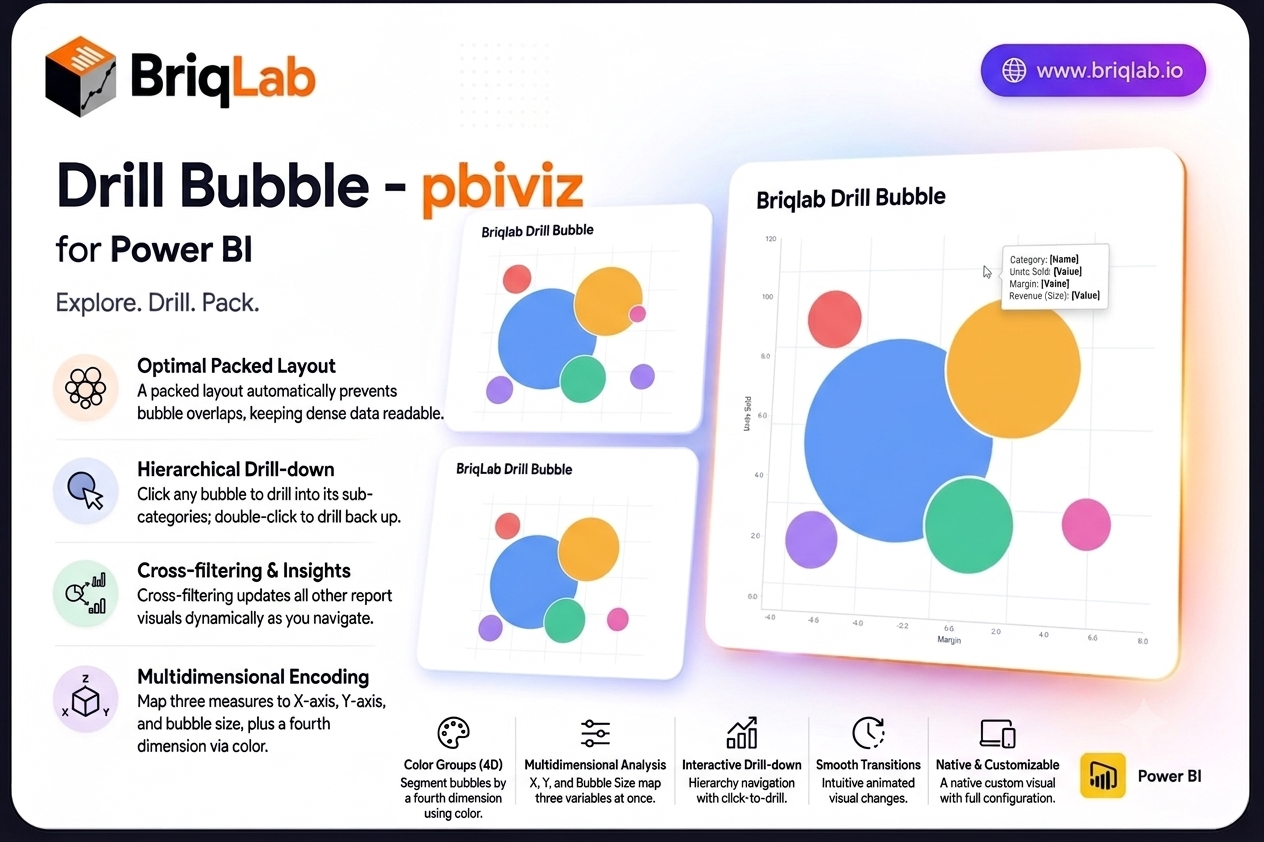
The Briqlab drill down bubble chart for Power BI brings three-dimensional analysis to your reports without the clutter of a traditional scatter plot. Map a category, an X measure, a Y measure, and a bubble size to explore three variables at once, then click any bubble to drill into its sub-categories. The packed layout prevents overlaps automatically, so dense data stays readable and every relationship stays in view. Key Features - Three measures encoded at once through X position, Y position, and bubble size - Packed layout engine that automatically prevents bubbles from overlapping - Colour groups that segment bubbles by a fourth dimension - Click any bubble to drill into its sub-categories, and double-click to drill back up - Cross-filtering that updates every other visual on the page as you navigate - Custom tooltips showing all four dimensions plus any extra tooltip fields you add - Bubble size variation that makes magnitude differences immediately clear - Animated transitions that keep hierarchical navigation smooth and intuitive Top Use Cases Product and pricing teams plot units sold against margin with revenue as bubble size, then drill from category into individual products. Marketing teams compare campaigns by reach, conversion, and spend in one view. Finance and portfolio teams map risk against return with position size encoded visually, while sales leaders explore territory performance across two metrics before drilling into accounts. Any analysis that compares entities across three variables, including supplier scoring, customer segmentation, and operational benchmarking, fits naturally into a single packed bubble layout. The drill path means a crowded top-level view stays clean, and detail appears only when an analyst asks for it. Why Choose the Briqlab Drill Down Bubble As a native Power BI custom visual, the Briqlab Drill Down Bubble delivers real interactivity rather than a static image. Clicking a bubble both drills the hierarchy and cross-filters the rest of your canvas, so one gesture reshapes the entire report. The packed layout keeps crowded data legible where a scatter plot would collapse into overlapping points, and colour groups add a fourth dimension without extra charts. Animated transitions, four-dimension tooltips, and configurable formatting give it the polish and depth of a first-party visual, and your formatting choices persist with the report so the experience is consistent for every viewer.
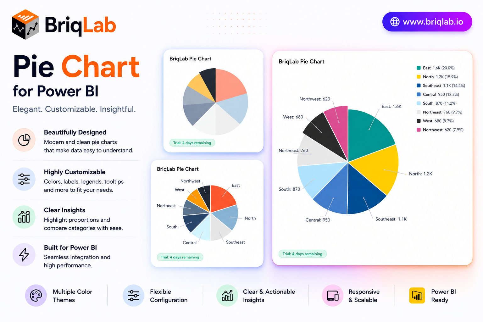
The Briqlab Power BI pie chart is a polished custom visual that adds professional data labels, a configurable legend, and custom segment colors to your reports. Show values, percentages, or category names as labels, and position the legend wherever it reads best. Designed natively for Power BI, this pie chart visual brings a smooth entry animation and clean slice borders to part-to-whole analysis, helping audiences grasp category breakdowns at a glance without sacrificing interactivity. It is the dependable upgrade for teams that want the built-in pie experience with sharper styling and full report cross-filtering. Key Features - Data labels showing values, percentages, or category names - Configurable legend positioned at top, bottom, left, or right - Up to 10 individual segment colors to match your brand - White segment border with adjustable width for clean separation - Optional total displayed in the chart title area - Click-to-cross-filter on any segment across the report - Right-click access to the Power BI context menu - Smooth entry animation on first data load Top Use Cases The Briqlab pie chart excels wherever a part-to-whole story matters. Finance teams visualize budget allocation across cost centers, while marketing reports break revenue down by channel or product category. Survey and research dashboards display response distribution with percentage labels, and operations teams show composition of inventory or workload by type. Sales reports use it to show share of pipeline by stage or region. Because the legend repositions freely and colors map to your brand, the same visual slots cleanly into executive summaries, customer-facing reports, and detailed analytical pages across every industry. Why Choose the Briqlab Pie Chart The Briqlab pie chart combines elegant presentation with true Power BI-native interactivity. Each slice is clickable, cross-filtering the rest of your report so a single selection drives the whole page. The Format pane gives you precise control over label content, legend placement, segment colors, and border width, while the white slice borders keep dense pies readable. The smooth entry animation adds professional polish, and the unified Briqlab palette ensures consistency with the rest of your Briqlab visuals and report theme. Because all styling lives in the Format pane rather than the data model, report authors can adjust labels, legend, and colors in seconds and reuse the chart across many pages.
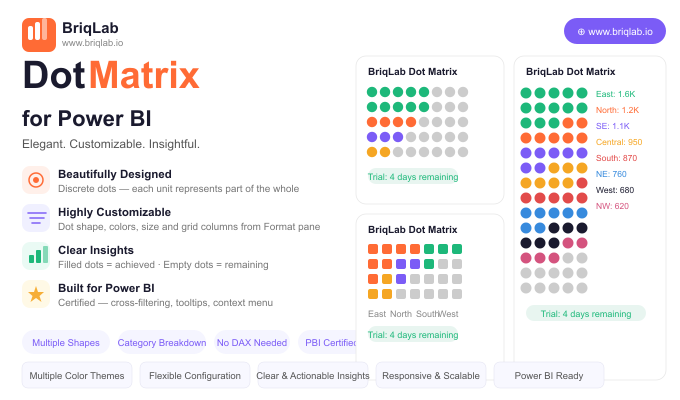
The Briqlab Dot Matrix is a dot matrix chart for Power BI, also known as an isotype or unit chart, that makes progress intuitive by replacing abstract bar lengths with discrete, countable dots. Each dot represents one unit of the whole: filled dots show what has been achieved, and empty dots show what remains. The result is a grid your audience can read at a glance and even count, turning percentages into something concrete and immediately understandable. Key Features - Discrete dots where each unit represents part of the whole for tangible progress - Filled dots for achieved values and empty dots for what remains - Configurable dot shapes including circle, square, diamond, and star - Custom achieved colour and empty colour to match your report theme - Adjustable dot size and grid column count from the Format pane - Optional category breakdown of the filled portion to show composition within progress - Automatic data reduction that handles large counts gracefully - Certified custom visual with cross-filtering and Power BI context menu support Top Use Cases The Briqlab Dot Matrix excels wherever a goal can be expressed in countable units. HR teams use it for headcount filled versus vacancies, manufacturing teams track units produced against planned output, and marketing teams monitor campaign goal progress such as leads or sign-ups captured to date. It also suits fundraising thermometers, project task completion, capacity utilisation, and any KPI where stakeholders respond better to a tangible "X of Y" picture than to an abstract bar or percentage. The optional category breakdown adds composition detail without losing the simple progress story. Why Choose the Briqlab Dot Matrix Bars and gauges show magnitude, but they do not let people count. The Briqlab Dot Matrix turns progress into discrete units, which is more persuasive in presentations and easier to grasp on shared dashboards. Every visual element is configurable from the Format pane: dot shape, achieved and empty colours, dot size, and grid columns, with no DAX required. The optional breakdown of the filled portion by category reveals what makes up your progress, and automatic data reduction keeps even very large counts performant. As a certified custom visual, it supports cross-filtering, tooltips, and the native context menu, so it behaves like a first-class part of your report rather than a bolt-on. The result is a progress visual that informs and persuades in equal measure.
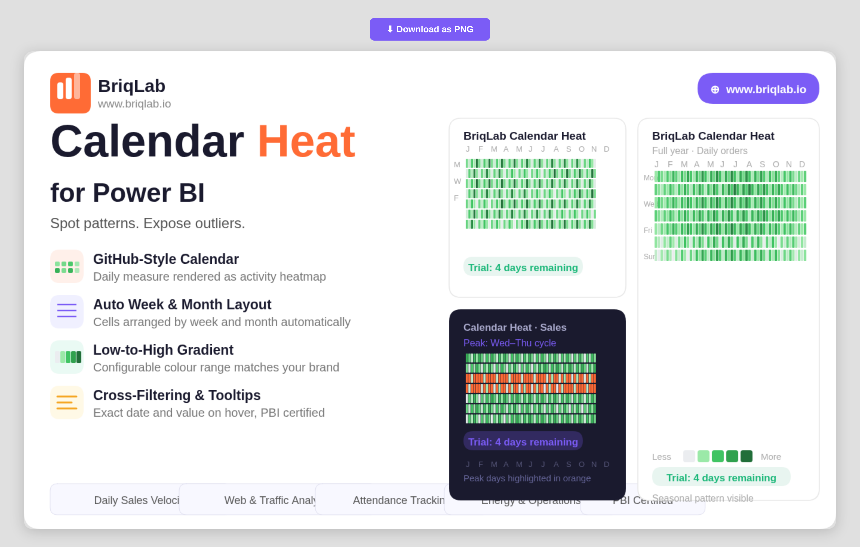
The Briqlab Calendar Heatmap is a calendar heatmap for Power BI that renders any daily numeric measure as a GitHub-style activity calendar. It instantly surfaces seasonal patterns, weekly cycles, and outlier days that disappear inside line and bar charts. Map a date column and a numeric measure, and the visual automatically arranges cells by week and month, applies a low-to-high colour gradient, and labels months and weekdays, so a full year of behaviour reads at a single glance. Key Features - GitHub-style activity calendar rendered from any daily numeric measure - Automatic arrangement of cells by week and month with no manual setup - Low-to-high colour gradient that highlights intensity across days - Configurable low and high gradient colours to match your brand or theme - Built-in month and weekday labels for easy orientation - Hover tooltips showing the exact date and value for any cell - Compact full-year layout that exposes seasonal and weekly cycles - Certified custom visual with cross-filtering and Power BI context menu support Top Use Cases The Briqlab Calendar Heatmap is built for any metric tracked day by day. Sales teams visualise daily sales velocity to spot strong and slow periods, while web and product teams analyse daily traffic and engagement to expose weekday and weekend cycles. Customer-success teams map daily contact volume, operations teams review energy usage, and marketing teams study social media engagement over time. It is equally effective for attendance, transaction counts, incident logs, and order volumes, anywhere recognising a recurring pattern or an unusual spike matters more than reading a single total. Why Choose the Briqlab Calendar Heatmap Line and bar charts compress a year into a shape that hides daily texture. The Briqlab Calendar Heatmap keeps every day visible, so seasonality, weekly rhythm, and one-off outliers stay obvious. Setup is effortless: bind a date and a measure and the visual handles the week-and-month layout, gradient, and labels for you. You retain control where it counts, configuring the low and high gradient colours to match your report theme, while exact-value tooltips keep precise figures one hover away. As a certified custom visual, it supports cross-filtering, tooltips, and the native Power BI context menu, so it slots into existing reports without compromise. For teams that live and die by daily numbers, it turns a year of data into an instantly legible story.
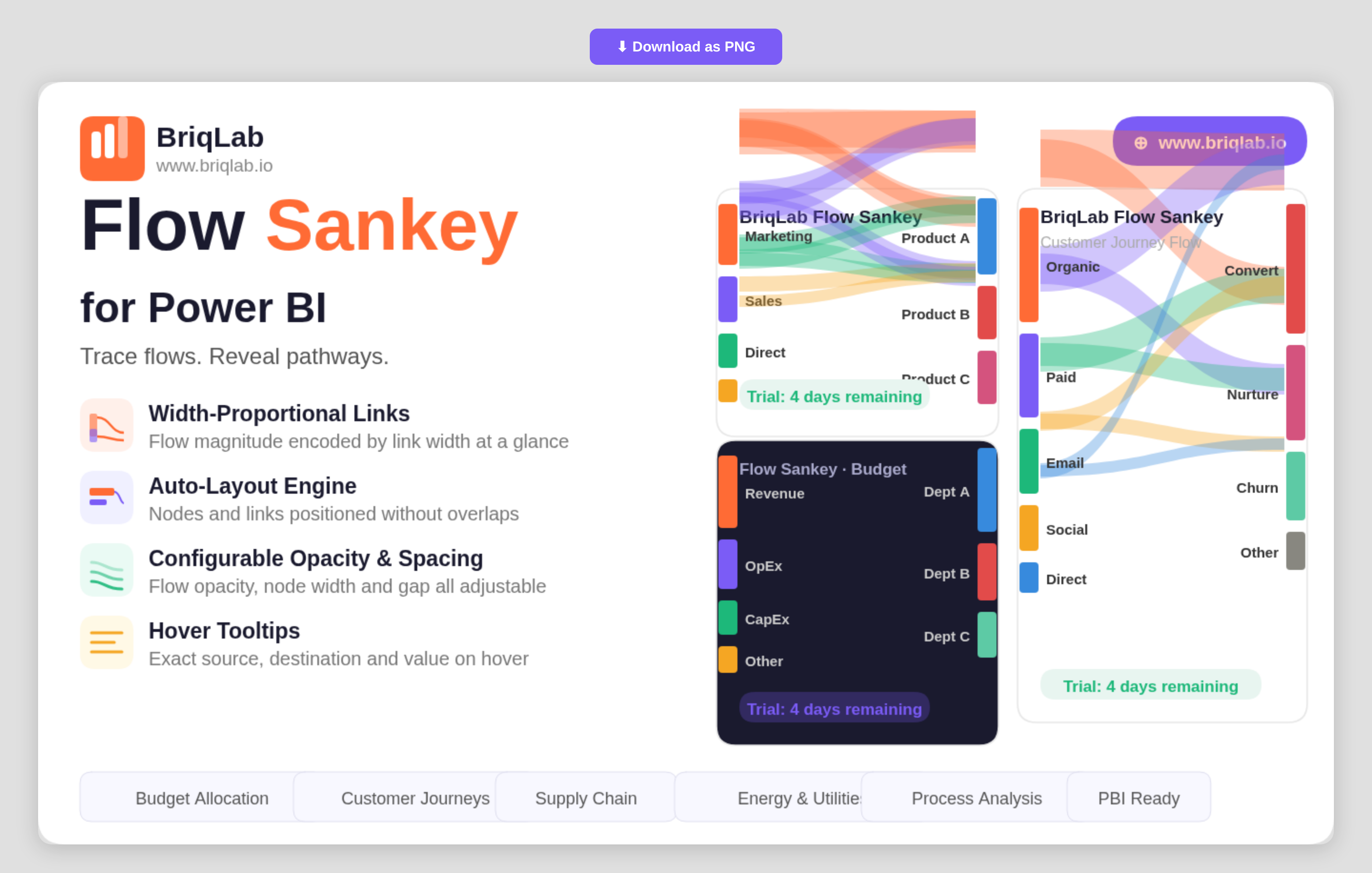
The Briqlab Sankey chart for Power BI visualises value flows between nodes with width-proportional links that make the magnitude of every flow immediately apparent. Connect two category columns as Source and Destination and a numeric measure as the Flow Value, and the auto-layout engine positions nodes and routes links without overlaps. It is the clearest way to show how budgets, customers, or materials move from one stage to the next inside a Power BI report. Key Features - Width-proportional links that encode the magnitude of each flow at a glance - Auto-layout engine that positions nodes and routes links without overlaps - Source, Destination, and Flow Value bindings driven by your own data - Configurable flow opacity to balance density and readability - Adjustable node width and node gap for fine control over spacing - Label threshold setting that hides labels on the smallest flows to reduce clutter - Configurable label fonts to match your report theme - Hover tooltips showing the exact source, destination, and value for any link Top Use Cases Finance teams trace budget allocation from department to cost centre and see exactly where money concentrates. Marketing and product teams map customer journeys across channels to reveal where traffic moves and where it leaks. Energy and utilities teams visualise how generation flows into consumption, while supply chain teams map materials from supplier to warehouse to destination. Process and operations analysts use it to show how items move through stages, making bottlenecks and major pathways immediately visible without reading a single number. Because each link width is drawn to scale, the diagram doubles as both an executive summary and an analytical view. Why Choose the Briqlab Sankey Chart Built as a native Power BI custom visual, the Briqlab Sankey Chart combines premium design with practical configurability. The auto-layout engine handles the hard work of positioning nodes and routing proportional links, so you get a clean diagram from raw category and value columns without manual setup. Flow opacity, node width, node gap, and label thresholds give you precise control over how dense or minimal the diagram reads. Per-link tooltips surface exact values on demand, keeping the visual both attractive on a dashboard and accurate enough for analysis. Formatting choices persist with the report, so the diagram you design renders identically for every viewer who opens it.
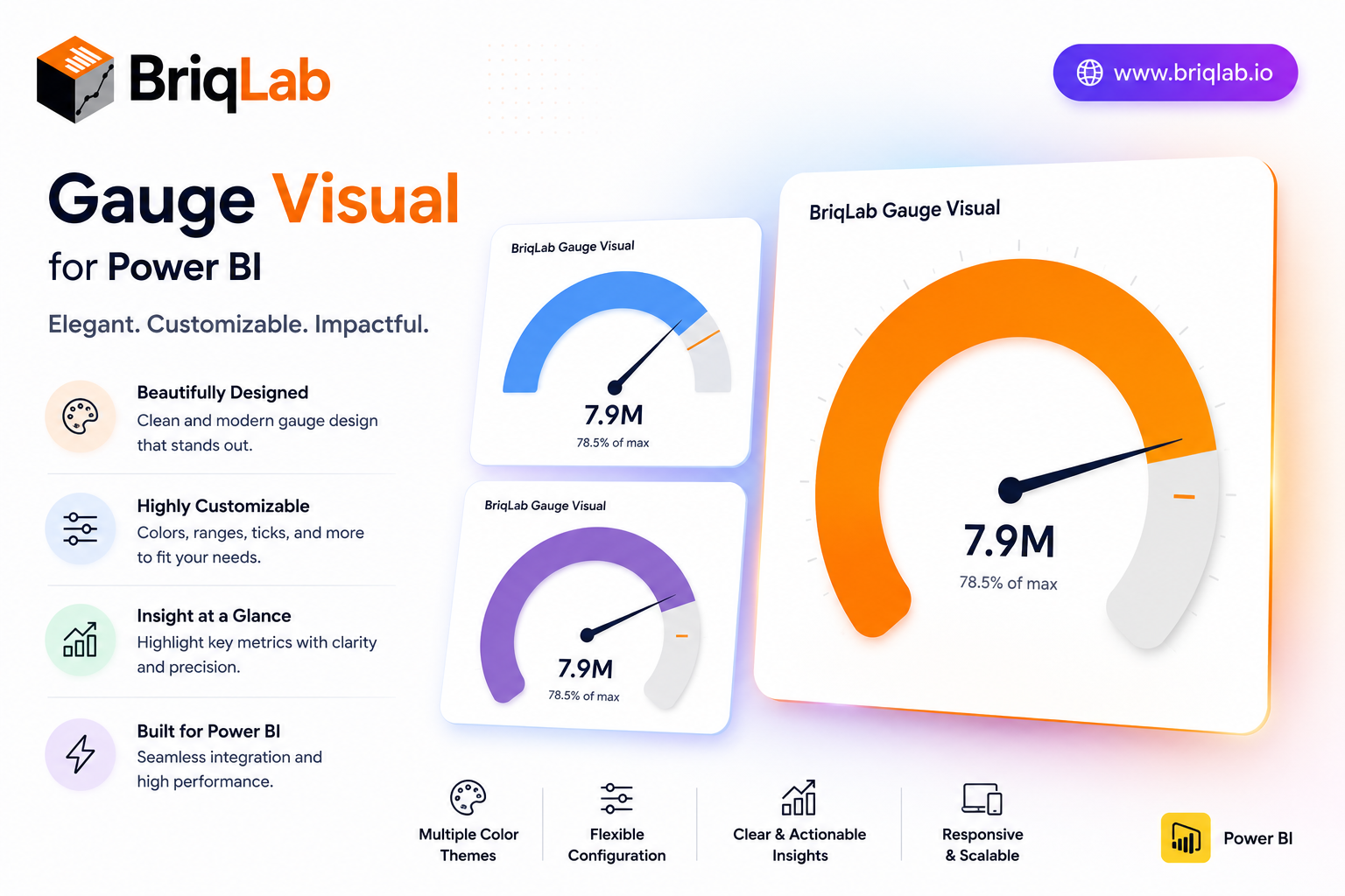
The Briqlab Power BI gauge is a clean, configurable speedometer custom visual that displays a single measure against configurable minimum, maximum, and target values. Three color zones for red, amber, and green are individually configurable with custom thresholds, so the gauge immediately communicates whether performance is poor, acceptable, or excellent. Built natively for Power BI, this gauge visual marks the goal exactly with a target needle and updates smoothly on every data refresh, giving any KPI a clear "how are we doing?" answer. It is the dependable choice when a single number needs an instant, color-coded verdict on a dashboard. Key Features - Single measure plotted against configurable min, max, and target - Three individually configurable color zones (red, amber, green) - Custom thresholds that define each performance band - Target needle that marks the goal exactly - Choice of automatic zone coloring or a single manual color - Configurable value font size and arc track color - Optional min and max labels shown on the gauge - Smooth gauge update on every data refresh Top Use Cases The Briqlab gauge suits any single-metric performance view. Finance and sales teams track revenue attainment against target, while customer experience dashboards monitor satisfaction scores against acceptable thresholds. Operations teams display utilization rates and inventory levels, and service teams watch SLA or capacity metrics at a glance. Project dashboards use it to show percentage complete against plan. Because the color zones are fully configurable, the same gauge adapts to good-when-high metrics like attainment and good-when-low metrics like error rates, making it a versatile status indicator across finance, operations, manufacturing, and customer-facing reporting. Why Choose the Briqlab Gauge The Briqlab gauge turns a single number into an instant verdict. Unlike generic meters, its three color zones and custom thresholds let you encode exactly what poor, acceptable, and excellent mean for your business, while the precise target needle keeps the goal in view. You can switch between automatic zone coloring and a single manual color, and tune value font size, arc track color, and min/max labels from the Format pane. The smooth refresh animation and unified Briqlab palette keep your performance dashboards polished and consistent. Because every threshold and color setting lives in the Format pane rather than the data model, report authors can recalibrate the zones in seconds and reuse the gauge confidently across multiple KPIs and reports.
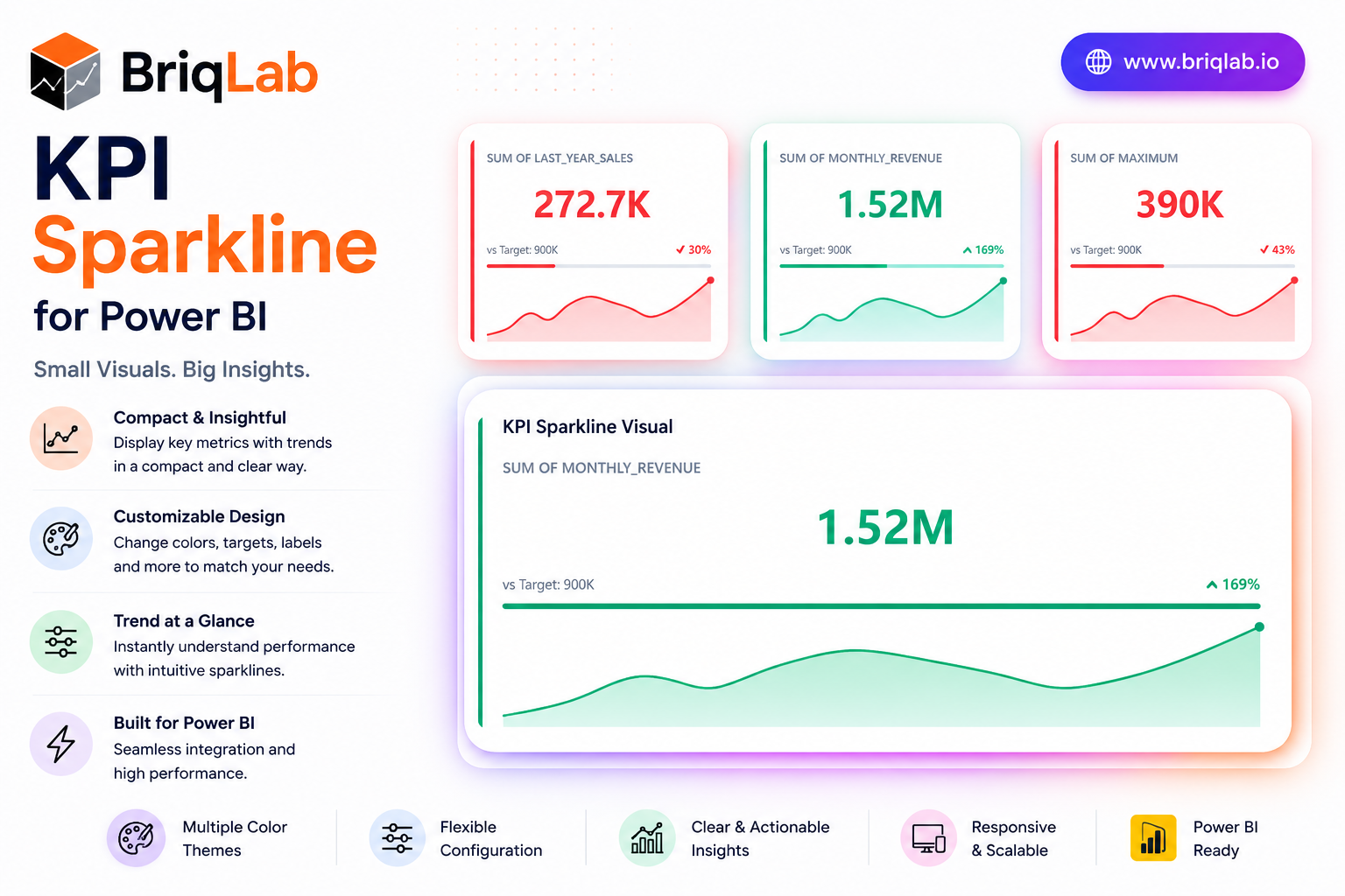
The Briqlab KPI Sparkline is a Power BI KPI sparkline card that layers four kinds of context into one compact tile: a headline metric, a historical trend line, a target progress bar, and a comparison delta. Where a plain number tells you only the current state, this visual shows where the metric has been, how it compares to the prior period, and how close it sits to target. The sparkline auto-colours by trend direction, so momentum is obvious the moment the report loads. Key Features - Headline KPI value paired with a comparison delta for instant context - Embedded sparkline trend line that auto-colours by direction - Sparkline type selectable as line or area - Target progress bar that fills left to right and recolours by attainment - Animated count-up that draws attention on report load - Configurable sparkline height, colour, and accent colour - Background colour, corner radius, and shadow options - Compact card layout that fits dense dashboard grids Top Use Cases The KPI Sparkline is purpose-built for dashboards where trend matters as much as the current value. Finance teams use it to track revenue, margin, and expense lines with a visible direction of travel. Sales organisations apply it to bookings, pipeline, and quota attainment, using the target bar to flag who is ahead or behind. Operations teams monitor throughput, SLA, and quality metrics where a single number hides the story. It suits monthly reporting packs, executive scorecards, and live operational walls alike. Why Choose the Briqlab KPI Sparkline The Briqlab KPI Sparkline gives you four layers of insight in the footprint of a single metric, without sacrificing clarity or polish. The trend line and progress bar recolour automatically based on direction and attainment, turning raw data into immediate visual signals. Every element, from sparkline type and height to accent colour, background, corner radius, and shadow, is set in the Format pane, so the card aligns with your brand. As a native Power BI custom visual, it supports the report interactions teams expect, delivering a premium, trend-aware card that built-in cards simply do not offer.
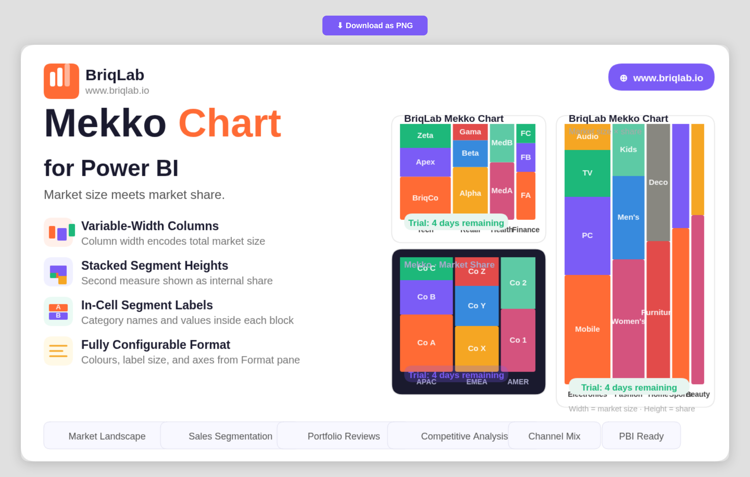
The Briqlab Mekko chart for Power BI encodes two dimensions in a single chart so you can read market size and market share at the same time. Also known as a Marimekko or mosaic chart, it sets column width from one measure, such as total market size, and column height from another, such as share. That dual encoding makes it the go-to visual for competitive analysis, where both how big a category is and how it splits internally matter equally. Key Features - Variable-width columns where width represents one measure such as total market size - Stacked segment heights that represent a second measure such as market share - Row Category, Column Category, and Values bindings driven by your own data - In-cell segment labels showing category names and values inside each block - Configurable segment colours to match your brand or report theme - Adjustable label font size for clear reading at any chart dimension - Axis formatting options controlled directly from the Format pane - A compact two-dimensional layout that replaces two separate charts with one Top Use Cases Strategy and product teams use the Mekko chart for market landscape reviews, where each column is a market sized by total value and each segment is a competitor's share within it. Sales leaders compare segments by both revenue contribution and internal mix. Portfolio managers assess product lines by size and composition in a single view, and consultants present competitive positioning without forcing the audience to cross-reference two charts. Any analysis where category size and internal breakdown both carry meaning, including channel mix and customer-tier reviews, fits the format. Because both measures sit in one chart, the audience reads the full story in a single glance rather than reconciling two separate visuals. Why Choose the Briqlab Mekko Chart As a native Power BI custom visual, the Briqlab Mekko Chart delivers a chart type the built-in library does not offer, with design quality suited to executive presentations. By encoding two measures through width and height, it communicates relationships that would otherwise require two charts and mental cross-referencing. In-cell labels keep every segment self-explanatory, while configurable segment colours, label sizing, and axis formatting let you tune the visual to your brand. The result is a competitive-analysis chart that is both presentation-ready and grounded in your live report data, with formatting that persists so every viewer sees the same polished layout.
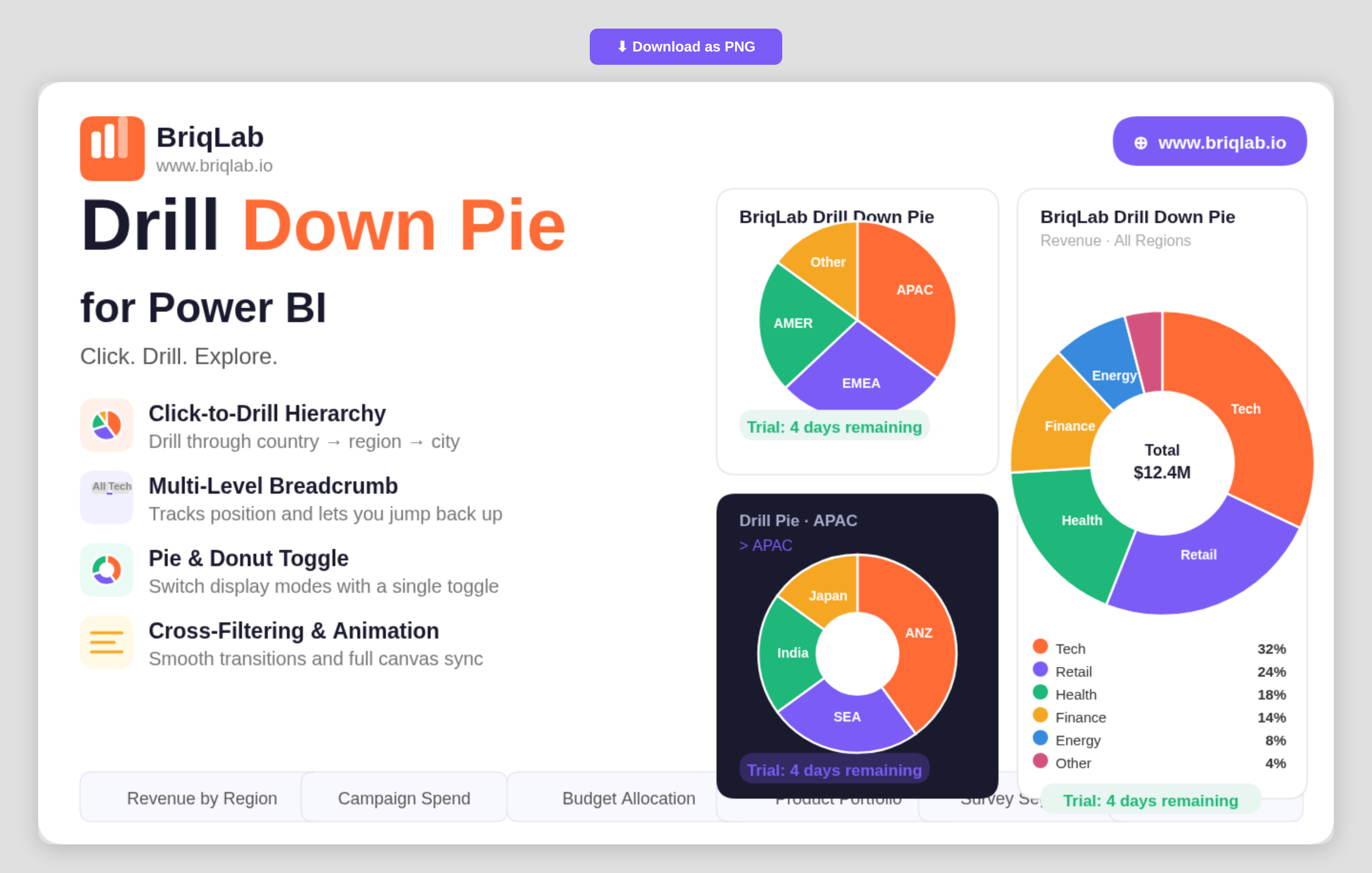
The Briqlab drill down pie chart for Power BI transforms a static slice view into an interactive exploration tool. Drag in a hierarchy of categories and click any segment to drill instantly into the next level, with a multi-level breadcrumb that always shows where you are. It is the part-to-whole visual your report has been missing when a single flat pie can no longer answer the question. Key Features - Click-to-drill navigation through a category hierarchy such as country, region, and city - Multi-level breadcrumb that tracks your current position and lets you jump back up - Single toggle to switch between pie and donut display modes - Up to 10 fully configurable segment colours to match your report theme - Data labels that show value, percentage, or category name - Cross-filtering that keeps every other visual on the page in sync as you drill - Right-click context menu with the full set of native Power BI actions - Custom tooltips that support additional fields beyond the default value - Smooth animated segment transitions on every drill and data refresh Top Use Cases Sales teams use the visual to move from total revenue down through region, territory, and individual rep without leaving the page. Marketing teams break campaign spend into channel and sub-channel. Finance teams explore budget allocation from division to cost centre, while operations teams drill from product family into individual SKUs. Any scenario that involves nested categories and part-to-whole comparison, including survey segmentation, portfolio breakdowns, and organisational headcount, becomes a guided click-through rather than a stack of separate charts. Because the drill state lives inside one tile, a single report page can replace several drill-through pages. Why Choose the Briqlab Drill Down Pie Built as a native Power BI custom visual, the Briqlab Drill Down Pie pairs polished design with genuine report interactivity. Drilling cross-filters the rest of your canvas automatically, so a single click reshapes every connected visual rather than just the pie itself. The breadcrumb and animated transitions keep deep hierarchies legible, and the pie-to-donut toggle plus 10 configurable colours let you match any brand. Right-click context menu support and custom tooltips mean it behaves exactly like a first-party visual, with formatting depth that the built-in pie cannot reach. Every formatting choice persists with the report, so the look you build is the look your audience sees.
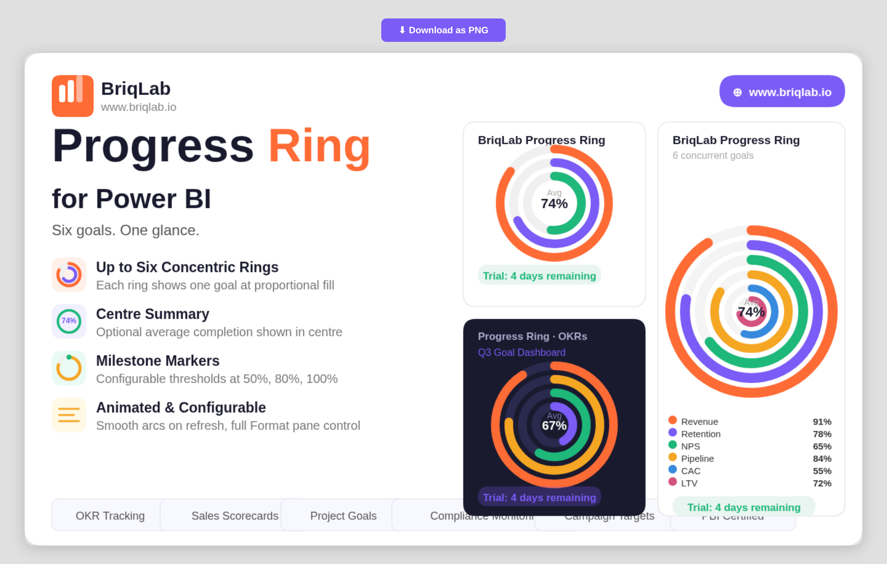
The Briqlab Progress Ring is a multi-ring progress chart for Power BI that displays up to six goals simultaneously as concentric, animated rings. Instead of stacking single gauges across a page, each metric becomes its own ring that fills proportionally to its percentage complete, so you can compare performance across several objectives in one compact, glanceable visual. The smooth animated arcs draw attention on every refresh, making it ideal for dashboards where multiple targets must stay visible side by side. Key Features - Displays up to six goals at once as concentric rings for instant multi-metric comparison - Each ring fills proportionally to its percentage complete with a smooth animated arc - Auto-colouring using the Briqlab brand palette, with manual per-ring colour overrides - Optional centre summary showing the average completion percentage - Milestone markers at configurable thresholds such as 50%, 80%, and 100% - Outer labels showing each category name and value - Fully configurable from the Format pane to match any report theme - Certified Power BI custom visual with cross-filtering support Top Use Cases The Progress Ring is built for any team juggling several targets at once. It is a natural fit for OKR tracking, where each ring represents a key result moving toward 100%. Programme and project teams use it for multi-metric scorecards and departmental goal dashboards, showing sales, retention, and efficiency targets together. Operations and compliance leads rely on it for health-and-safety compliance monitoring, while marketing teams track concurrent campaign goals. Anywhere progress against several objectives must be communicated quickly to executives, the concentric layout keeps every goal in view. Why Choose the Briqlab Progress Ring Single-value gauges only tell part of the story; Briqlab Progress Ring consolidates up to six of them into one coherent visual, saving valuable dashboard space without losing clarity. The optional centre summary gives an immediate average-completion read, while configurable milestone markers add the reference points stakeholders look for. Auto-colouring from the unified Briqlab palette keeps rings on-brand by default, and manual overrides give designers full control. As a native Power BI custom visual, it animates on refresh, respects report themes, and participates in cross-filtering out of the box.
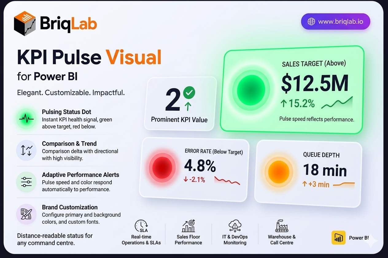
The Briqlab Pulse KPI is a Power BI Pulse KPI card that adds a living heartbeat to your dashboards. A pulsing status dot, green when the metric is above target and red when it falls below, communicates KPI health instantly, even from across a room. Alongside the dot, the card presents the current value, a comparison delta with a directional arrow, a mini trend indicator, and a configurable label. The pulse speed and colour respond automatically to performance, so status is never in doubt. Key Features - Pulsing status dot, green above target and red below, for instant health signals - Current KPI value displayed prominently on the card - Comparison delta with a directional arrow showing change - Mini trend indicator for at-a-glance momentum - Configurable text label to describe the metric - Pulse animation speed and colour that respond to performance status - Configurable primary colour and background colour - Custom font selection from the Format pane Top Use Cases The Pulse KPI is built for environments where status matters more than fine detail. Real-time operations dashboards use it to flag SLA breaches, queue depth, or uptime, with the pulsing dot alerting teams the moment a metric turns red. Sales floor displays surface live quota and pipeline health to motivate teams. IT and DevOps monitoring screens track error rates, latency, and system health where an immediate red signal prompts action. It also suits warehouse, call centre, and command-centre walls where staff need to read KPI status from a distance. Why Choose the Briqlab Pulse KPI The Briqlab Pulse KPI turns a passive number into an active signal. The pulsing dot and adaptive animation respond automatically to whether the metric is above or below target, so dashboards communicate urgency without anyone reading the figure. The card still carries full context, including the value, comparison delta, directional arrow, and trend indicator, balancing alerting with detail. Primary colour, background, and font are all configurable in the Format pane to match your brand. As a native Power BI custom visual, it integrates cleanly with your reports and the interactions your teams already rely on.
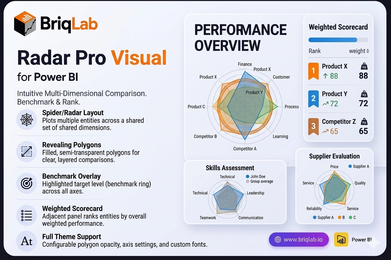
The Briqlab Radar Pro is a radar chart for Power BI that makes multi-dimensional comparison genuinely intuitive. Also known as a spider chart, it plots two or more entities — products, teams, time periods, or competitors — across a shared set of dimensions so the filled polygons immediately reveal which entity is strongest on which criteria. Where tables and bar charts force side-by-side scanning, the overlapping shapes of a radar chart let decision-makers read relative strengths and weaknesses in a single glance. Key Features - Spider/radar layout that plots multiple entities across a shared set of dimensions (criteria) - Filled, semi-transparent polygons that reveal comparative strengths at a glance - Benchmark overlay ring that highlights a target level across all axes simultaneously - Adjacent scorecard panel that ranks entities by weighted score - Configurable polygon fill opacity for clear, layered comparisons - Adjustable axis labels and configurable gridline count for precise scaling - Custom font settings to match your report theme and brand - Certified Power BI custom visual with full cross-filtering support Top Use Cases The Radar Pro suits any scenario built on multi-criteria evaluation. Use it for balanced scorecard analysis across finance, customer, process, and learning perspectives, or for competitive benchmarking where you compare your offering against rivals on price, quality, and service. HR and L D teams rely on it for skills assessment across competencies, while product teams use it for feature comparison between releases or SKUs. It also fits supplier evaluation, vendor selection, and any review where several entities must be measured against the same set of dimensions. Why Choose the Briqlab Radar Pro Most radar visuals stop at drawing polygons. Briqlab Radar Pro pairs the chart with a benchmark overlay ring and a ranked scorecard panel, so you see both the visual pattern and the quantified outcome in one place. The weighted scoring turns subjective "looks stronger" impressions into a defensible ranking, making it ideal for executive reviews and procurement decisions. Built natively for Power BI, it inherits cross-filtering, theming, and refresh behaviour automatically, and the configurable opacity, gridlines, and labels keep dense comparisons readable rather than cluttered.
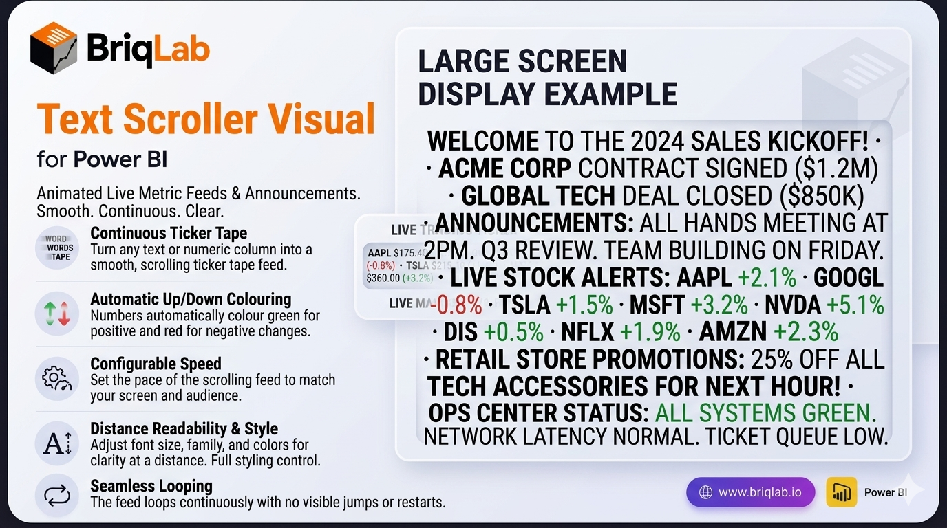
The Briqlab Power BI text scroller is an animated custom visual that turns any text or numeric column into a smooth, horizontally-scrolling ticker tape. Built natively for Power BI, it is ideal for live metric feeds, announcements, and digital signage on large screens. Connect a text or numeric measure and the values scroll continuously across the visual at your configured speed, looping seamlessly with no jumps. With automatic up/down colouring and full styling control, the text scroller brings a broadcast-quality news ticker to any dashboard. Key Features - Smooth, continuously scrolling ticker tape from any text or numeric column - Seamless looping with no visible jumps or resets - Automatic positive/negative colouring in green and red for up/down metrics - Configurable scroll speed to set the pace of the feed - Adjustable font size and font family for readability at distance - Custom text colour and background colour to match your theme - Configurable separator character between items - Unified Briqlab brand colour palette for consistent reporting Top Use Cases The Briqlab text scroller is built for screens people watch rather than click. Retail floors run live sales totals and promotions; operations centres scroll throughput, uptime, and SLA status; trading desks push live price and movement feeds with automatic green/red colouring on rising and falling values. Event venues and reception areas display rolling announcements and welcome messages, while sales teams keep a motivating ticker of deals closed in view of the whole floor. Anywhere a dashboard is shown on a large screen and needs to communicate frequent updates at a glance, the scrolling ticker keeps key metrics and messages moving, readable, and impossible to miss.
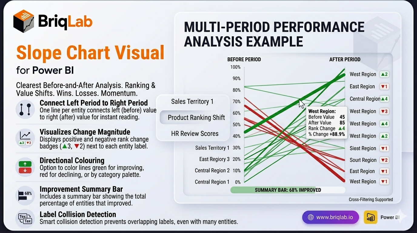
The Briqlab Slope Chart is a slope chart for Power BI and the clearest way to show how rankings or values changed between two time periods. Each entity is drawn as a single line connecting its left-period value to its right-period value, so rising lines stand out instantly from falling ones and the slope angle communicates the magnitude of every change. Where stacked bars or paired columns force tedious comparison, this two-period view turns winners, losers, and momentum into something readers grasp at a glance. Key Features - One line per entity connecting the left period to the right period for instant before/after reading - Slope angle that communicates the magnitude of each change at a glance - Rank-change badges such as ▲3 and ▼2 displayed next to each label - Colour by direction (green for improving, red for declining) or by category palette - Summary bar showing what percentage of entities improved - Label collision detection that prevents overlapping text even with many entities - Format-pane control over colours, fonts, and labels to match your theme - Certified Power BI custom visual with cross-filtering support Top Use Cases The Slope Chart shines wherever a before-and-after comparison drives the conversation. Sales leaders use it for territory analysis, showing which regions climbed or slipped between quarters. Marketing and merchandising teams track product ranking shifts after a launch or price change, while HR teams visualise employee performance review movements period over period. It also fits market share changes, survey score comparisons, and budget reallocations. Any time the question is "what changed between then and now?", the connected slope lines deliver an immediate, defensible answer.
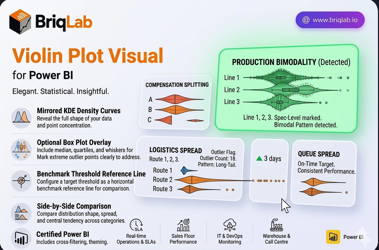
The Briqlab Violin Plot is a statistical distribution visual for Power BI that reveals the full shape of your data, not just the average. Its mirrored KDE (kernel density estimate) curves show exactly where data points concentrate, exposing patterns that means and medians hide. An optional box plot overlay adds median, quartiles, and whiskers, while individual outlier dots flag extreme values. When you suspect your data is bimodal, skewed, or shaped by outliers, a violin plot is the chart that surfaces what summary statistics quietly conceal. Key Features - Mirrored KDE density curves that show where data points are concentrated - Optional box plot overlay with median, quartiles, and whiskers - Individual outlier dots that mark extreme values clearly - Configurable reference line to mark a benchmark or target threshold - Side-by-side comparison of distributions across multiple categories - Surfaces bimodal, skewed, and outlier-driven patterns that averages hide - Format-pane control over colours, fonts, and overlay options - Certified Power BI custom visual with cross-filtering support Top Use Cases The Violin Plot is the right choice for any statistical review where distribution matters. Quality control teams use it to spot bimodal measurement patterns and out-of-spec outliers on the production line. HR and compensation analysts apply it to salary band analysis, checking whether pay clusters fairly or splits into hidden groups. Customer experience teams examine satisfaction-score distribution to see beyond a single average rating, while logistics teams analyse delivery time spread to catch long-tail delays. Wherever a mean alone is misleading, the violin shape tells the real story.
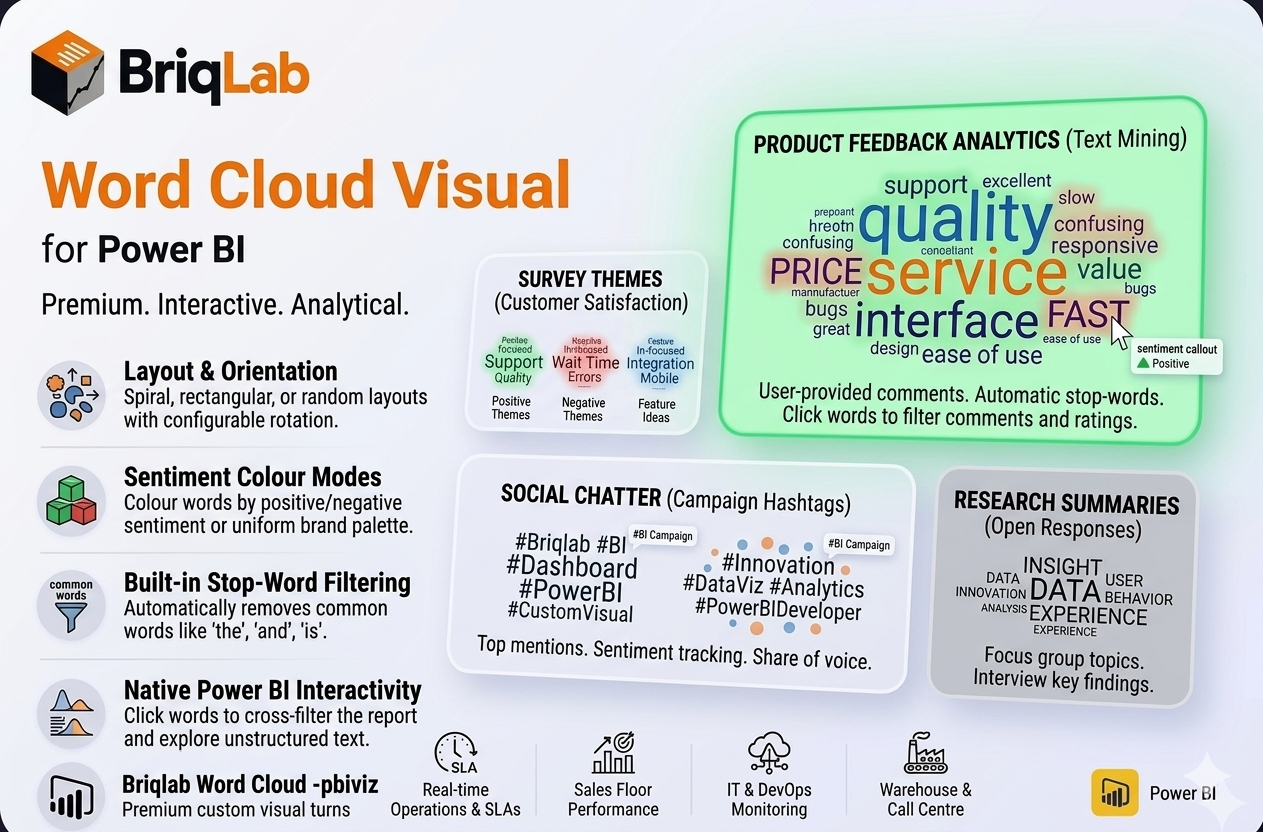
The Briqlab Power BI word cloud is a premium custom visual that turns raw text into a weighted keyword cloud where word size reflects frequency or a numeric weight measure. Built natively for Power BI, it makes themes in survey responses, reviews, and social posts instantly visible. Map a text column, add an optional weight, and the visual arranges words by importance with clean placement, automatic stop-word filtering, and full report interactivity, giving analysts a fast, attractive way to surface what matters most in unstructured text. ## Key Features - Word size driven by frequency or a numeric weight measure - Spiral, rectangular, or random placement layouts - Colour modes for uniform brand colour, random palette, or sentiment (positive/negative) - Built-in stop-word filtering removes common words such as the, and, is - Custom stop-word list to exclude terms specific to your data - Configurable rotation angle for varied word orientation - Adjustable minimum and maximum font size and font family - Click any word to cross-filter the rest of the report - Unified Briqlab brand colour palette for consistent reporting Top Use Cases The Briqlab word cloud excels wherever text volume hides the signal and reading every row is impractical. Customer experience teams surface recurring themes in feedback and support tickets, while product managers mine review text to see which features customers mention most often. Marketing analysts visualise social media chatter and campaign hashtags, and research teams summarise hundreds of open-ended survey responses at a glance. With sentiment colouring, positive and negative language stand apart immediately, making the word cloud equally useful for brand monitoring, voice-of-customer programmes, employee engagement surveys, and qualitative text analysis across any industry. Why Choose the Briqlab Word Cloud The Briqlab word cloud combines genuine Power BI-native interactivity with text-analysis features rarely found together in one visual. Built-in stop-word filtering and a custom exclusion list keep clouds meaningful instead of cluttered with filler words. Sentiment colouring adds an analytical layer that plain frequency clouds lack, and three placement layouts let you match the look to your report. Every word participates in cross-filtering, so a single click reshapes the rest of the page, and the unified Briqlab palette keeps dashboards on brand without manual styling.
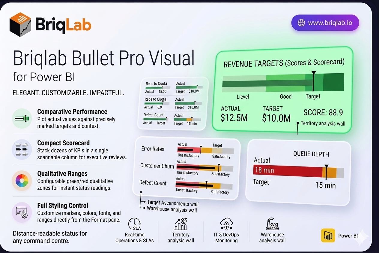
The Briqlab Bullet Pro is a bullet chart for Power BI that makes performance tracking instantly intuitive. Inspired by Stephen Few's original design, it plots each actual value against its target with a clear comparative marker, then surrounds it with three colour-coded qualitative ranges so you can read status at a glance. It answers the one question every dashboard needs to address: how did we do against the goal? Unlike gauges that consume a full tile per metric, the bullet chart packs the same actual, target, and range context into a slim horizontal bar, so you can present an entire scorecard's worth of KPIs in a single, scannable column. Key Features - Plots actual values against targets with a precise comparative marker line - Three configurable colour-coded qualitative ranges (for example unsatisfactory, satisfactory, good) - Compact horizontal layout that stacks dozens of KPIs without scrolling - Configurable zone colours to match your brand or report theme - Customisable comparative marker style for clear target indication - Animated bar fill that draws attention on every data refresh - Adjustable axis scale for consistent comparison across measures - Full Format pane control with no DAX workarounds required - Certified custom visual with cross-filtering and Power BI context menu support Top Use Cases The Briqlab Bullet Pro is ideal anywhere you measure outcomes against goals. Use it on balanced scorecards to track strategic objectives, in HR dashboards for headcount and engagement targets, and across financial reporting to monitor revenue, cost, and margin attainment. Its compact layout makes it perfect for sales scorecards comparing reps to quota, operational KPI walls, and executive summary pages where many metrics must share limited space. Whenever a single number needs context against a benchmark, the bullet chart communicates it faster than a gauge or standalone card.
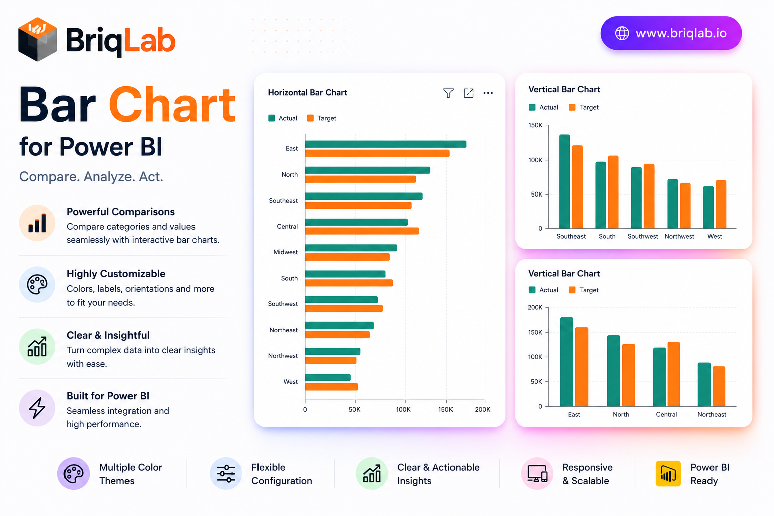
The Briqlab Power BI bar chart is a polished, production-ready custom visual that goes well beyond the built-in chart. Display single or grouped bars, switch between vertical and horizontal orientation in one click, and add a comparison series to see actuals against targets side by side. Built natively for Power BI, it delivers clean design and full report interactivity without any DAX tricks, giving analysts a dependable bar chart visual for every dashboard. Whether you are building an executive overview or a detailed analytical page, this custom visual keeps comparisons clear and your reports looking sharp. Key Features - Single or grouped bars with one-click vertical or horizontal orientation - Comparison series to plot actuals versus targets side by side - Configurable data labels, axis titles, and gridlines - Adjustable corner radius and bar padding for a custom look - Full font and color settings from the Format pane - Cross-filtering and cross-highlighting that work out of the box - Right-click access to the full Power BI context menu - Unified Briqlab brand color palette for consistent reporting Top Use Cases The Briqlab bar chart fits virtually any reporting scenario. Finance teams compare budget versus actual spend; sales leaders rank revenue by region or product line; operations dashboards track output against plan using the comparison series. Marketing analysts visualize campaign results by channel, while HR reports break down headcount by department. Because orientation toggles instantly, the same visual works for long category lists shown horizontally and for time-based comparisons shown as vertical columns. The grouped-bar mode handles multi-series breakdowns such as product by quarter, making it a flexible choice across retail, manufacturing, healthcare, and professional-services reporting. Why Choose the Briqlab Bar Chart The Briqlab bar chart pairs refined design with genuine Power BI-native interactivity. Unlike static alternatives, every bar participates in cross-filtering and cross-highlighting, so a single click reshapes the rest of your report. The comparison series turns an ordinary chart into an instant performance view, and the Format pane exposes labels, gridlines, corner radius, padding, and fonts without custom code. The unified Briqlab palette keeps your dashboards on brand, and the right-click context menu preserves the familiar Power BI experience users expect. Because every setting lives in the Format pane rather than in your data model, report authors can restyle the chart in seconds and reuse it confidently across multiple pages and reports.
Subscribe to BriqLab Pro and get every AppSource-certified visual plus 300+ templates and 6 AI tools — one workspace.
See pricing →BriqLab