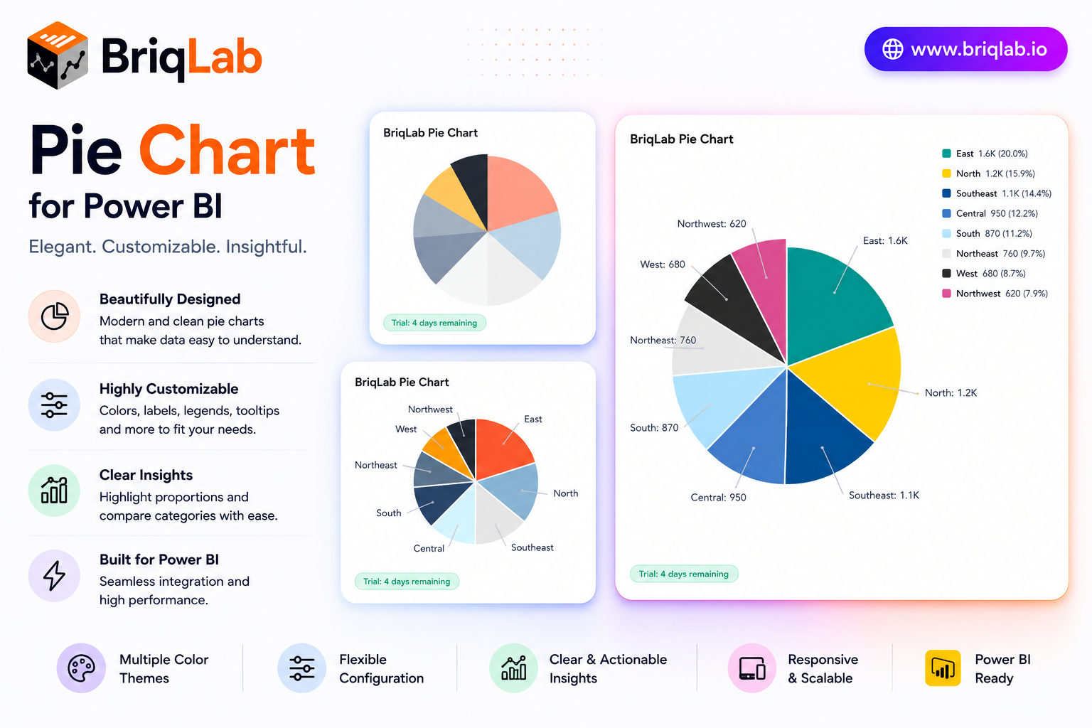
The Briqlab Power BI pie chart is a polished custom visual that adds professional data labels, a configurable legend, and custom segment colors to your reports. Show values, percentages, or category names as labels, and position the legend wherever it reads best. Designed natively for Power BI, this pie chart visual brings a smooth entry animation and clean slice borders to part-to-whole analysis, helping audiences grasp category breakdowns at a glance without sacrificing interactivity. It is the dependable upgrade for teams that want the built-in pie experience with sharper styling and full report cross-filtering.
Key Features
- Data labels showing values, percentages, or category names
- Configurable legend positioned at top, bottom, left, or right
- Up to 10 individual segment colors to match your brand
- White segment border with adjustable width for clean separation
- Optional total displayed in the chart title area
- Click-to-cross-filter on any segment across the report
- Right-click access to the Power BI context menu
- Smooth entry animation on first data load
Top Use Cases
The Briqlab pie chart excels wherever a part-to-whole story matters. Finance teams visualize budget allocation across cost centers, while marketing reports break revenue down by channel or product category. Survey and research dashboards display response distribution with percentage labels, and operations teams show composition of inventory or workload by type. Sales reports use it to show share of pipeline by stage or region. Because the legend repositions freely and colors map to your brand, the same visual slots cleanly into executive summaries, customer-facing reports, and detailed analytical pages across every industry.
Why Choose the Briqlab Pie Chart
The Briqlab pie chart combines elegant presentation with true Power BI-native interactivity. Each slice is clickable, cross-filtering the rest of your report so a single selection drives the whole page. The Format pane gives you precise control over label content, legend placement, segment colors, and border width, while the white slice borders keep dense pies readable. The smooth entry animation adds professional polish, and the unified Briqlab palette ensures consistency with the rest of your Briqlab visuals and report theme. Because all styling lives in the Format pane rather than the data model, report authors can adjust labels, legend, and colors in seconds and reuse the chart across many pages.