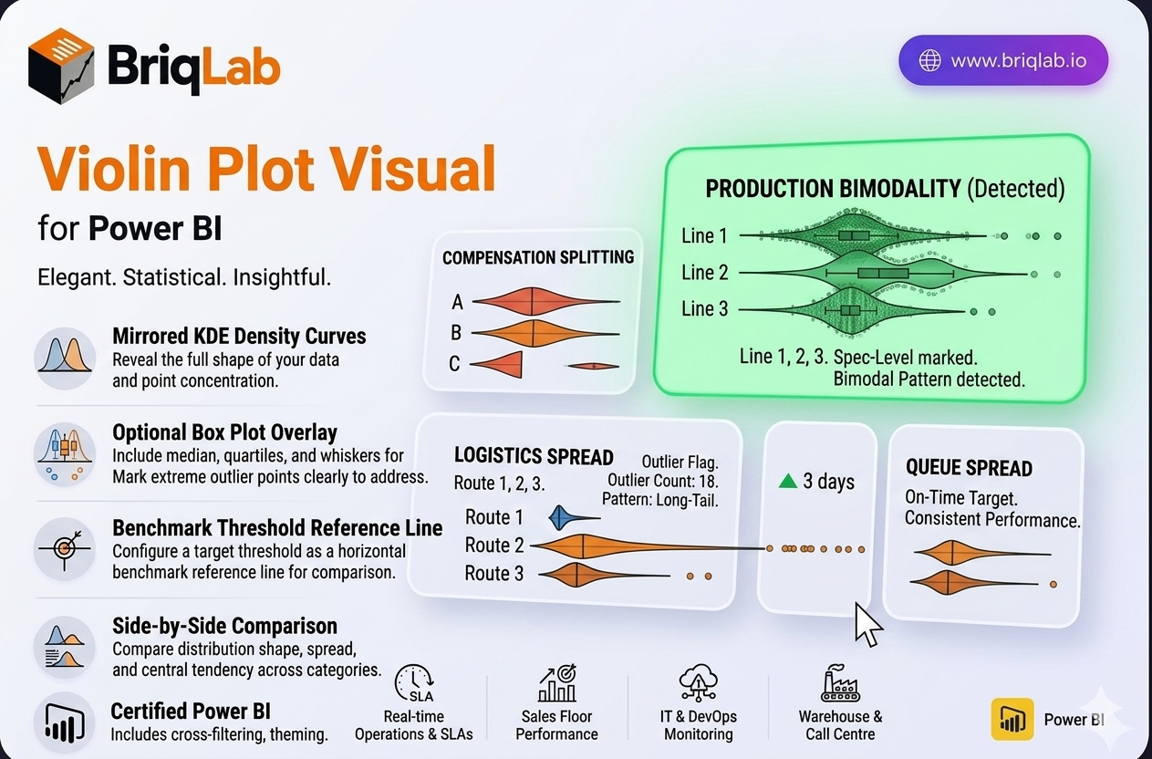
The Briqlab Violin Plot is a statistical distribution visual for Power BI that reveals the full shape of your data, not just the average. Its mirrored KDE (kernel density estimate) curves show exactly where data points concentrate, exposing patterns that means and medians hide. An optional box plot overlay adds median, quartiles, and whiskers, while individual outlier dots flag extreme values. When you suspect your data is bimodal, skewed, or shaped by outliers, a violin plot is the chart that surfaces what summary statistics quietly conceal.
Key Features
- Mirrored KDE density curves that show where data points are concentrated
- Optional box plot overlay with median, quartiles, and whiskers
- Individual outlier dots that mark extreme values clearly
- Configurable reference line to mark a benchmark or target threshold
- Side-by-side comparison of distributions across multiple categories
- Surfaces bimodal, skewed, and outlier-driven patterns that averages hide
- Format-pane control over colours, fonts, and overlay options
- Certified Power BI custom visual with cross-filtering support
Top Use Cases
The Violin Plot is the right choice for any statistical review where distribution matters. Quality control teams use it to spot bimodal measurement patterns and out-of-spec outliers on the production line. HR and compensation analysts apply it to salary band analysis, checking whether pay clusters fairly or splits into hidden groups. Customer experience teams examine satisfaction-score distribution to see beyond a single average rating, while logistics teams analyse delivery time spread to catch long-tail delays. Wherever a mean alone is misleading, the violin shape tells the real story.