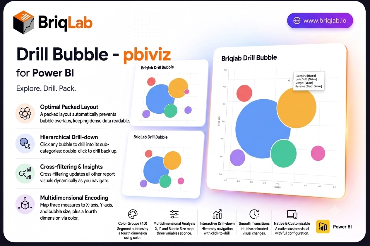
The Briqlab drill down bubble chart for Power BI brings three-dimensional analysis to your reports without the clutter of a traditional scatter plot. Map a category, an X measure, a Y measure, and a bubble size to explore three variables at once, then click any bubble to drill into its sub-categories. The packed layout prevents overlaps automatically, so dense data stays readable and every relationship stays in view.
Key Features
- Three measures encoded at once through X position, Y position, and bubble size
- Packed layout engine that automatically prevents bubbles from overlapping
- Colour groups that segment bubbles by a fourth dimension
- Click any bubble to drill into its sub-categories, and double-click to drill back up
- Cross-filtering that updates every other visual on the page as you navigate
- Custom tooltips showing all four dimensions plus any extra tooltip fields you add
- Bubble size variation that makes magnitude differences immediately clear
- Animated transitions that keep hierarchical navigation smooth and intuitive
Top Use Cases
Product and pricing teams plot units sold against margin with revenue as bubble size, then drill from category into individual products. Marketing teams compare campaigns by reach, conversion, and spend in one view. Finance and portfolio teams map risk against return with position size encoded visually, while sales leaders explore territory performance across two metrics before drilling into accounts. Any analysis that compares entities across three variables, including supplier scoring, customer segmentation, and operational benchmarking, fits naturally into a single packed bubble layout. The drill path means a crowded top-level view stays clean, and detail appears only when an analyst asks for it.
Why Choose the Briqlab Drill Down Bubble
As a native Power BI custom visual, the Briqlab Drill Down Bubble delivers real interactivity rather than a static image. Clicking a bubble both drills the hierarchy and cross-filters the rest of your canvas, so one gesture reshapes the entire report. The packed layout keeps crowded data legible where a scatter plot would collapse into overlapping points, and colour groups add a fourth dimension without extra charts. Animated transitions, four-dimension tooltips, and configurable formatting give it the polish and depth of a first-party visual, and your formatting choices persist with the report so the experience is consistent for every viewer.