The Briqlab Dot Matrix is a dot matrix chart for Power BI, also known as an isotype or unit chart, that makes progress intuitive by replacing abstract bar lengths with discrete, countable dots. Each dot represents one unit of the whole: filled dots show what has been achieved, and empty dots show what remains. The result is a grid your audience can read at a glance and even count, turning percentages into something concrete and immediately understandable.
Key Features
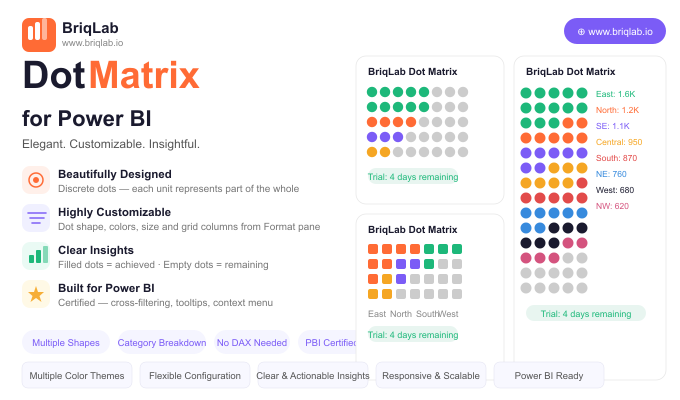
- Discrete dots where each unit represents part of the whole for tangible progress
- Filled dots for achieved values and empty dots for what remains
- Configurable dot shapes including circle, square, diamond, and star
- Custom achieved colour and empty colour to match your report theme
- Adjustable dot size and grid column count from the Format pane
- Optional category breakdown of the filled portion to show composition within progress
- Automatic data reduction that handles large counts gracefully
- Certified custom visual with cross-filtering and Power BI context menu support
Top Use Cases
The Briqlab Dot Matrix excels wherever a goal can be expressed in countable units. HR teams use it for headcount filled versus vacancies, manufacturing teams track units produced against planned output, and marketing teams monitor campaign goal progress such as leads or sign-ups captured to date. It also suits fundraising thermometers, project task completion, capacity utilisation, and any KPI where stakeholders respond better to a tangible "X of Y" picture than to an abstract bar or percentage. The optional category breakdown adds composition detail without losing the simple progress story.
Why Choose the Briqlab Dot Matrix
Bars and gauges show magnitude, but they do not let people count. The Briqlab Dot Matrix turns progress into discrete units, which is more persuasive in presentations and easier to grasp on shared dashboards. Every visual element is configurable from the Format pane: dot shape, achieved and empty colours, dot size, and grid columns, with no DAX required. The optional breakdown of the filled portion by category reveals what makes up your progress, and automatic data reduction keeps even very large counts performant. As a certified custom visual, it supports cross-filtering, tooltips, and the native context menu, so it behaves like a first-class part of your report rather than a bolt-on. The result is a progress visual that informs and persuades in equal measure.