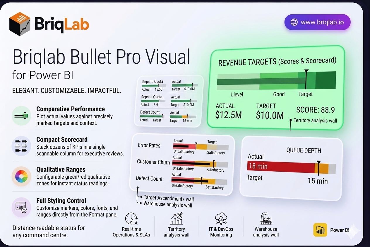
The Briqlab Bullet Pro is a bullet chart for Power BI that makes performance tracking instantly intuitive. Inspired by Stephen Few's original design, it plots each actual value against its target with a clear comparative marker, then surrounds it with three colour-coded qualitative ranges so you can read status at a glance. It answers the one question every dashboard needs to address: how did we do against the goal? Unlike gauges that consume a full tile per metric, the bullet chart packs the same actual, target, and range context into a slim horizontal bar, so you can present an entire scorecard's worth of KPIs in a single, scannable column.
Key Features
- Plots actual values against targets with a precise comparative marker line
- Three configurable colour-coded qualitative ranges (for example unsatisfactory, satisfactory, good)
- Compact horizontal layout that stacks dozens of KPIs without scrolling
- Configurable zone colours to match your brand or report theme
- Customisable comparative marker style for clear target indication
- Animated bar fill that draws attention on every data refresh
- Adjustable axis scale for consistent comparison across measures
- Full Format pane control with no DAX workarounds required
- Certified custom visual with cross-filtering and Power BI context menu support
Top Use Cases
The Briqlab Bullet Pro is ideal anywhere you measure outcomes against goals. Use it on balanced scorecards to track strategic objectives, in HR dashboards for headcount and engagement targets, and across financial reporting to monitor revenue, cost, and margin attainment. Its compact layout makes it perfect for sales scorecards comparing reps to quota, operational KPI walls, and executive summary pages where many metrics must share limited space. Whenever a single number needs context against a benchmark, the bullet chart communicates it faster than a gauge or standalone card.