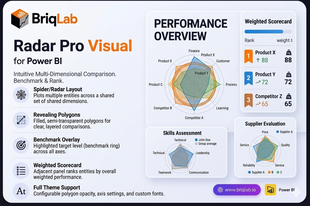
The Briqlab Radar Pro is a radar chart for Power BI that makes multi-dimensional comparison genuinely intuitive. Also known as a spider chart, it plots two or more entities — products, teams, time periods, or competitors — across a shared set of dimensions so the filled polygons immediately reveal which entity is strongest on which criteria. Where tables and bar charts force side-by-side scanning, the overlapping shapes of a radar chart let decision-makers read relative strengths and weaknesses in a single glance.
Key Features
- Spider/radar layout that plots multiple entities across a shared set of dimensions (criteria)
- Filled, semi-transparent polygons that reveal comparative strengths at a glance
- Benchmark overlay ring that highlights a target level across all axes simultaneously
- Adjacent scorecard panel that ranks entities by weighted score
- Configurable polygon fill opacity for clear, layered comparisons
- Adjustable axis labels and configurable gridline count for precise scaling
- Custom font settings to match your report theme and brand
- Certified Power BI custom visual with full cross-filtering support
Top Use Cases
The Radar Pro suits any scenario built on multi-criteria evaluation. Use it for balanced scorecard analysis across finance, customer, process, and learning perspectives, or for competitive benchmarking where you compare your offering against rivals on price, quality, and service. HR and L&D teams rely on it for skills assessment across competencies, while product teams use it for feature comparison between releases or SKUs. It also fits supplier evaluation, vendor selection, and any review where several entities must be measured against the same set of dimensions.
Why Choose the Briqlab Radar Pro
Most radar visuals stop at drawing polygons. Briqlab Radar Pro pairs the chart with a benchmark overlay ring and a ranked scorecard panel, so you see both the visual pattern and the quantified outcome in one place. The weighted scoring turns subjective "looks stronger" impressions into a defensible ranking, making it ideal for executive reviews and procurement decisions. Built natively for Power BI, it inherits cross-filtering, theming, and refresh behaviour automatically, and the configurable opacity, gridlines, and labels keep dense comparisons readable rather than cluttered.