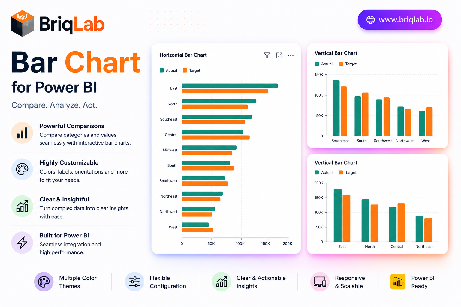
The Briqlab Power BI bar chart is a polished, production-ready custom visual that goes well beyond the built-in chart. Display single or grouped bars, switch between vertical and horizontal orientation in one click, and add a comparison series to see actuals against targets side by side. Built natively for Power BI, it delivers clean design and full report interactivity without any DAX tricks, giving analysts a dependable bar chart visual for every dashboard. Whether you are building an executive overview or a detailed analytical page, this custom visual keeps comparisons clear and your reports looking sharp.
Key Features
- Single or grouped bars with one-click vertical or horizontal orientation
- Comparison series to plot actuals versus targets side by side
- Configurable data labels, axis titles, and gridlines
- Adjustable corner radius and bar padding for a custom look
- Full font and color settings from the Format pane
- Cross-filtering and cross-highlighting that work out of the box
- Right-click access to the full Power BI context menu
- Unified Briqlab brand color palette for consistent reporting
Top Use Cases
The Briqlab bar chart fits virtually any reporting scenario. Finance teams compare budget versus actual spend; sales leaders rank revenue by region or product line; operations dashboards track output against plan using the comparison series. Marketing analysts visualize campaign results by channel, while HR reports break down headcount by department. Because orientation toggles instantly, the same visual works for long category lists shown horizontally and for time-based comparisons shown as vertical columns. The grouped-bar mode handles multi-series breakdowns such as product by quarter, making it a flexible choice across retail, manufacturing, healthcare, and professional-services reporting.
Why Choose the Briqlab Bar Chart
The Briqlab bar chart pairs refined design with genuine Power BI-native interactivity. Unlike static alternatives, every bar participates in cross-filtering and cross-highlighting, so a single click reshapes the rest of your report. The comparison series turns an ordinary chart into an instant performance view, and the Format pane exposes labels, gridlines, corner radius, padding, and fonts without custom code. The unified Briqlab palette keeps your dashboards on brand, and the right-click context menu preserves the familiar Power BI experience users expect. Because every setting lives in the Format pane rather than in your data model, report authors can restyle the chart in seconds and reuse it confidently across multiple pages and reports.