The Briqlab Sankey chart for Power BI visualises value flows between nodes with width-proportional links that make the magnitude of every flow immediately apparent. Connect two category columns as Source and Destination and a numeric measure as the Flow Value, and the auto-layout engine positions nodes and routes links without overlaps. It is the clearest way to show how budgets, customers, or materials move from one stage to the next inside a Power BI report.
Key Features
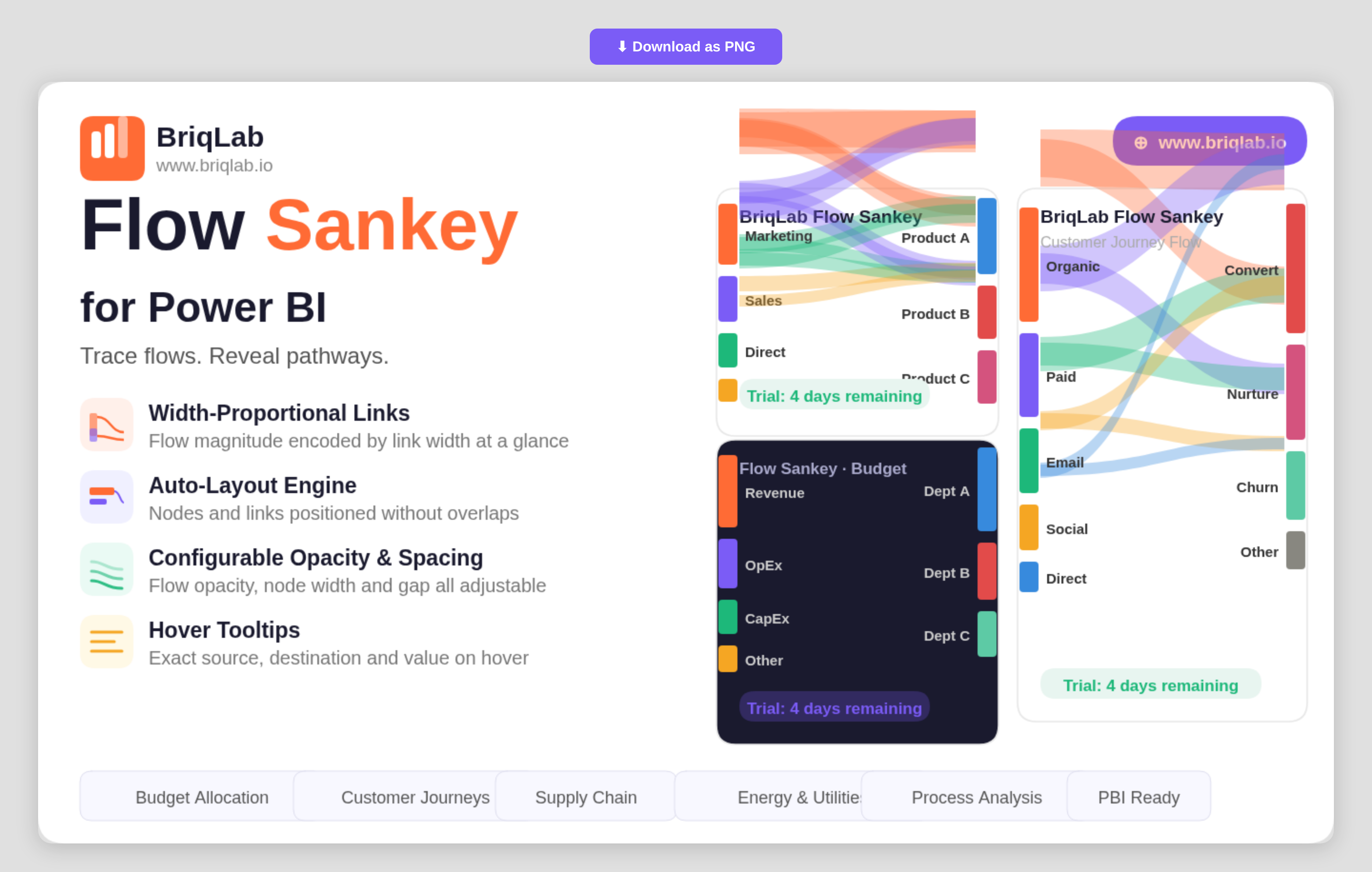
- Width-proportional links that encode the magnitude of each flow at a glance
- Auto-layout engine that positions nodes and routes links without overlaps
- Source, Destination, and Flow Value bindings driven by your own data
- Configurable flow opacity to balance density and readability
- Adjustable node width and node gap for fine control over spacing
- Label threshold setting that hides labels on the smallest flows to reduce clutter
- Configurable label fonts to match your report theme
- Hover tooltips showing the exact source, destination, and value for any link
Top Use Cases
Finance teams trace budget allocation from department to cost centre and see exactly where money concentrates. Marketing and product teams map customer journeys across channels to reveal where traffic moves and where it leaks. Energy and utilities teams visualise how generation flows into consumption, while supply chain teams map materials from supplier to warehouse to destination. Process and operations analysts use it to show how items move through stages, making bottlenecks and major pathways immediately visible without reading a single number. Because each link width is drawn to scale, the diagram doubles as both an executive summary and an analytical view.
Why Choose the Briqlab Sankey Chart
Built as a native Power BI custom visual, the Briqlab Sankey Chart combines premium design with practical configurability. The auto-layout engine handles the hard work of positioning nodes and routing proportional links, so you get a clean diagram from raw category and value columns without manual setup. Flow opacity, node width, node gap, and label thresholds give you precise control over how dense or minimal the diagram reads. Per-link tooltips surface exact values on demand, keeping the visual both attractive on a dashboard and accurate enough for analysis. Formatting choices persist with the report, so the diagram you design renders identically for every viewer who opens it.