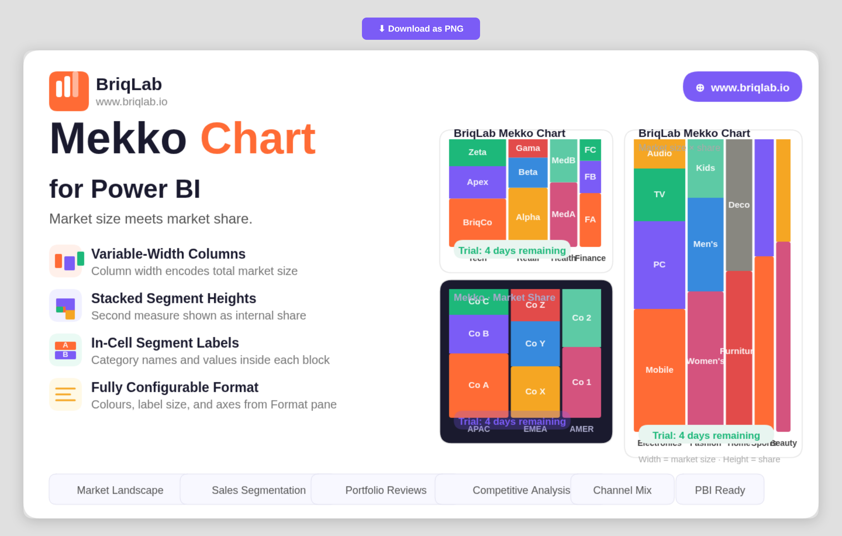
The Briqlab Mekko chart for Power BI encodes two dimensions in a single chart so you can read market size and market share at the same time. Also known as a Marimekko or mosaic chart, it sets column width from one measure, such as total market size, and column height from another, such as share. That dual encoding makes it the go-to visual for competitive analysis, where both how big a category is and how it splits internally matter equally.
Key Features
- Variable-width columns where width represents one measure such as total market size
- Stacked segment heights that represent a second measure such as market share
- Row Category, Column Category, and Values bindings driven by your own data
- In-cell segment labels showing category names and values inside each block
- Configurable segment colours to match your brand or report theme
- Adjustable label font size for clear reading at any chart dimension
- Axis formatting options controlled directly from the Format pane
- A compact two-dimensional layout that replaces two separate charts with one
Top Use Cases
Strategy and product teams use the Mekko chart for market landscape reviews, where each column is a market sized by total value and each segment is a competitor's share within it. Sales leaders compare segments by both revenue contribution and internal mix. Portfolio managers assess product lines by size and composition in a single view, and consultants present competitive positioning without forcing the audience to cross-reference two charts. Any analysis where category size and internal breakdown both carry meaning, including channel mix and customer-tier reviews, fits the format. Because both measures sit in one chart, the audience reads the full story in a single glance rather than reconciling two separate visuals.
Why Choose the Briqlab Mekko Chart
As a native Power BI custom visual, the Briqlab Mekko Chart delivers a chart type the built-in library does not offer, with design quality suited to executive presentations. By encoding two measures through width and height, it communicates relationships that would otherwise require two charts and mental cross-referencing. In-cell labels keep every segment self-explanatory, while configurable segment colours, label sizing, and axis formatting let you tune the visual to your brand. The result is a competitive-analysis chart that is both presentation-ready and grounded in your live report data, with formatting that persists so every viewer sees the same polished layout.