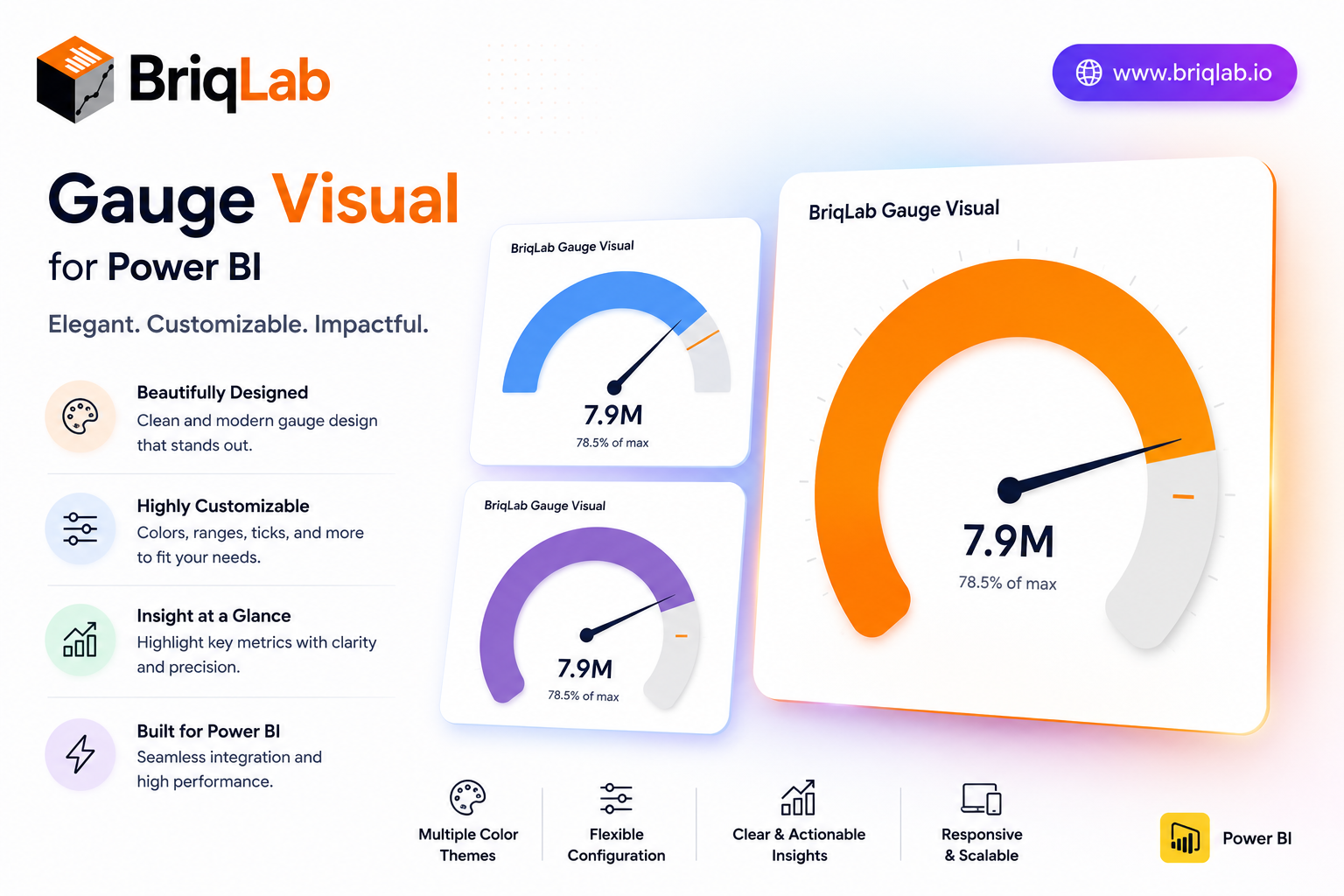
The Briqlab Power BI gauge is a clean, configurable speedometer custom visual that displays a single measure against configurable minimum, maximum, and target values. Three color zones for red, amber, and green are individually configurable with custom thresholds, so the gauge immediately communicates whether performance is poor, acceptable, or excellent. Built natively for Power BI, this gauge visual marks the goal exactly with a target needle and updates smoothly on every data refresh, giving any KPI a clear "how are we doing?" answer. It is the dependable choice when a single number needs an instant, color-coded verdict on a dashboard.
Key Features
- Single measure plotted against configurable min, max, and target
- Three individually configurable color zones (red, amber, green)
- Custom thresholds that define each performance band
- Target needle that marks the goal exactly
- Choice of automatic zone coloring or a single manual color
- Configurable value font size and arc track color
- Optional min and max labels shown on the gauge
- Smooth gauge update on every data refresh
Top Use Cases
The Briqlab gauge suits any single-metric performance view. Finance and sales teams track revenue attainment against target, while customer experience dashboards monitor satisfaction scores against acceptable thresholds. Operations teams display utilization rates and inventory levels, and service teams watch SLA or capacity metrics at a glance. Project dashboards use it to show percentage complete against plan. Because the color zones are fully configurable, the same gauge adapts to good-when-high metrics like attainment and good-when-low metrics like error rates, making it a versatile status indicator across finance, operations, manufacturing, and customer-facing reporting.
Why Choose the Briqlab Gauge
The Briqlab gauge turns a single number into an instant verdict. Unlike generic meters, its three color zones and custom thresholds let you encode exactly what poor, acceptable, and excellent mean for your business, while the precise target needle keeps the goal in view. You can switch between automatic zone coloring and a single manual color, and tune value font size, arc track color, and min/max labels from the Format pane. The smooth refresh animation and unified Briqlab palette keep your performance dashboards polished and consistent. Because every threshold and color setting lives in the Format pane rather than the data model, report authors can recalibrate the zones in seconds and reuse the gauge confidently across multiple KPIs and reports.