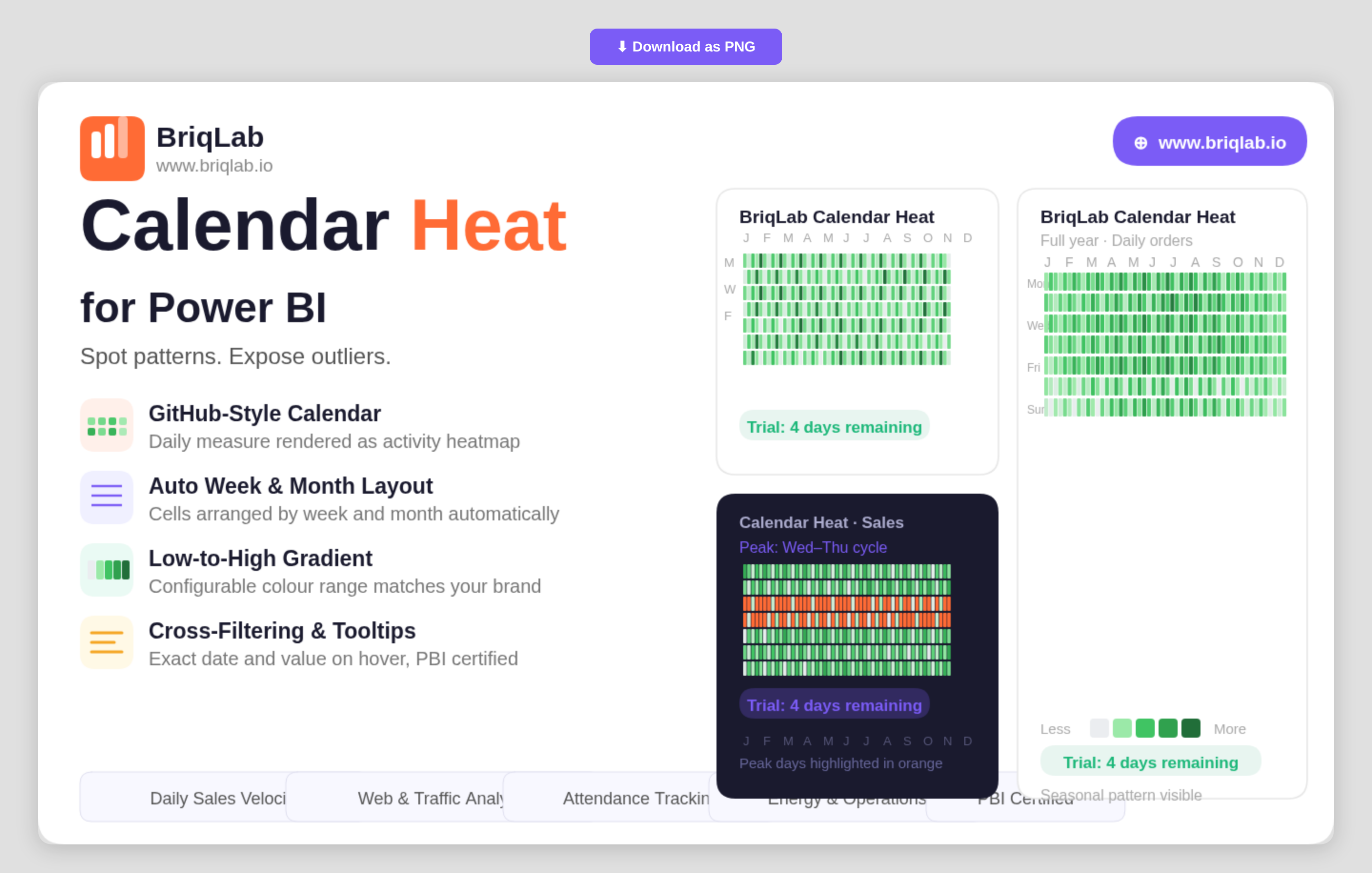
The Briqlab Calendar Heatmap is a calendar heatmap for Power BI that renders any daily numeric measure as a GitHub-style activity calendar. It instantly surfaces seasonal patterns, weekly cycles, and outlier days that disappear inside line and bar charts. Map a date column and a numeric measure, and the visual automatically arranges cells by week and month, applies a low-to-high colour gradient, and labels months and weekdays, so a full year of behaviour reads at a single glance.
Key Features
- GitHub-style activity calendar rendered from any daily numeric measure
- Automatic arrangement of cells by week and month with no manual setup
- Low-to-high colour gradient that highlights intensity across days
- Configurable low and high gradient colours to match your brand or theme
- Built-in month and weekday labels for easy orientation
- Hover tooltips showing the exact date and value for any cell
- Compact full-year layout that exposes seasonal and weekly cycles
- Certified custom visual with cross-filtering and Power BI context menu support
Top Use Cases
The Briqlab Calendar Heatmap is built for any metric tracked day by day. Sales teams visualise daily sales velocity to spot strong and slow periods, while web and product teams analyse daily traffic and engagement to expose weekday and weekend cycles. Customer-success teams map daily contact volume, operations teams review energy usage, and marketing teams study social media engagement over time. It is equally effective for attendance, transaction counts, incident logs, and order volumes, anywhere recognising a recurring pattern or an unusual spike matters more than reading a single total.
Why Choose the Briqlab Calendar Heatmap
Line and bar charts compress a year into a shape that hides daily texture. The Briqlab Calendar Heatmap keeps every day visible, so seasonality, weekly rhythm, and one-off outliers stay obvious. Setup is effortless: bind a date and a measure and the visual handles the week-and-month layout, gradient, and labels for you. You retain control where it counts, configuring the low and high gradient colours to match your report theme, while exact-value tooltips keep precise figures one hover away. As a certified custom visual, it supports cross-filtering, tooltips, and the native Power BI context menu, so it slots into existing reports without compromise. For teams that live and die by daily numbers, it turns a year of data into an instantly legible story.