The Briqlab Slope Chart is a slope chart for Power BI and the clearest way to show how rankings or values changed between two time periods. Each entity is drawn as a single line connecting its left-period value to its right-period value, so rising lines stand out instantly from falling ones and the slope angle communicates the magnitude of every change. Where stacked bars or paired columns force tedious comparison, this two-period view turns winners, losers, and momentum into something readers grasp at a glance.
Key Features
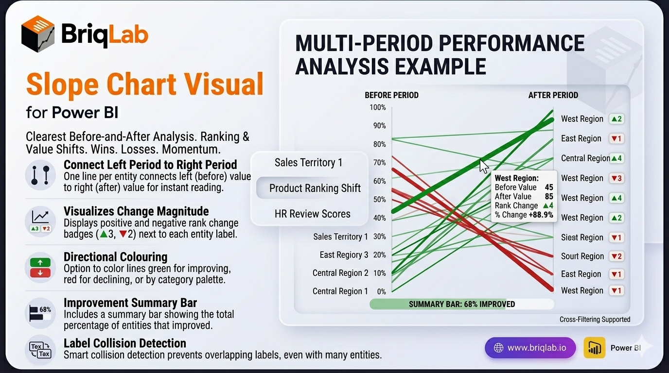
- One line per entity connecting the left period to the right period for instant before/after reading
- Slope angle that communicates the magnitude of each change at a glance
- Rank-change badges such as ▲3 and ▼2 displayed next to each label
- Colour by direction (green for improving, red for declining) or by category palette
- Summary bar showing what percentage of entities improved
- Label collision detection that prevents overlapping text even with many entities
- Format-pane control over colours, fonts, and labels to match your theme
- Certified Power BI custom visual with cross-filtering support
Top Use Cases
The Slope Chart shines wherever a before-and-after comparison drives the conversation. Sales leaders use it for territory analysis, showing which regions climbed or slipped between quarters. Marketing and merchandising teams track product ranking shifts after a launch or price change, while HR teams visualise employee performance review movements period over period. It also fits market share changes, survey score comparisons, and budget reallocations. Any time the question is "what changed between then and now?", the connected slope lines deliver an immediate, defensible answer.