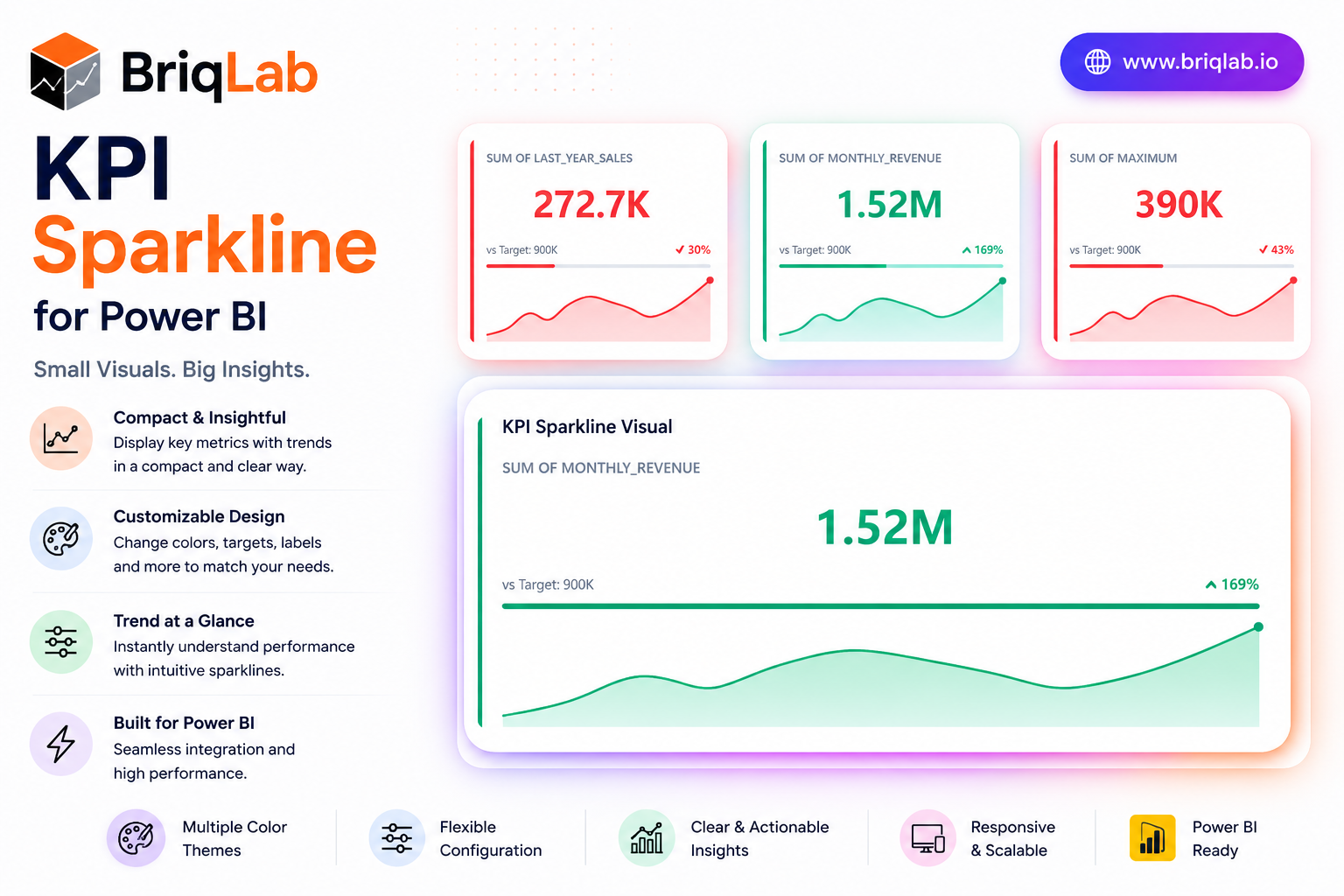
The Briqlab KPI Sparkline is a Power BI KPI sparkline card that layers four kinds of context into one compact tile: a headline metric, a historical trend line, a target progress bar, and a comparison delta. Where a plain number tells you only the current state, this visual shows where the metric has been, how it compares to the prior period, and how close it sits to target. The sparkline auto-colours by trend direction, so momentum is obvious the moment the report loads.
Key Features
- Headline KPI value paired with a comparison delta for instant context
- Embedded sparkline trend line that auto-colours by direction
- Sparkline type selectable as line or area
- Target progress bar that fills left to right and recolours by attainment
- Animated count-up that draws attention on report load
- Configurable sparkline height, colour, and accent colour
- Background colour, corner radius, and shadow options
- Compact card layout that fits dense dashboard grids
Top Use Cases
The KPI Sparkline is purpose-built for dashboards where trend matters as much as the current value. Finance teams use it to track revenue, margin, and expense lines with a visible direction of travel. Sales organisations apply it to bookings, pipeline, and quota attainment, using the target bar to flag who is ahead or behind. Operations teams monitor throughput, SLA, and quality metrics where a single number hides the story. It suits monthly reporting packs, executive scorecards, and live operational walls alike.
Why Choose the Briqlab KPI Sparkline
The Briqlab KPI Sparkline gives you four layers of insight in the footprint of a single metric, without sacrificing clarity or polish. The trend line and progress bar recolour automatically based on direction and attainment, turning raw data into immediate visual signals. Every element, from sparkline type and height to accent colour, background, corner radius, and shadow, is set in the Format pane, so the card aligns with your brand. As a native Power BI custom visual, it supports the report interactions teams expect, delivering a premium, trend-aware card that built-in cards simply do not offer.