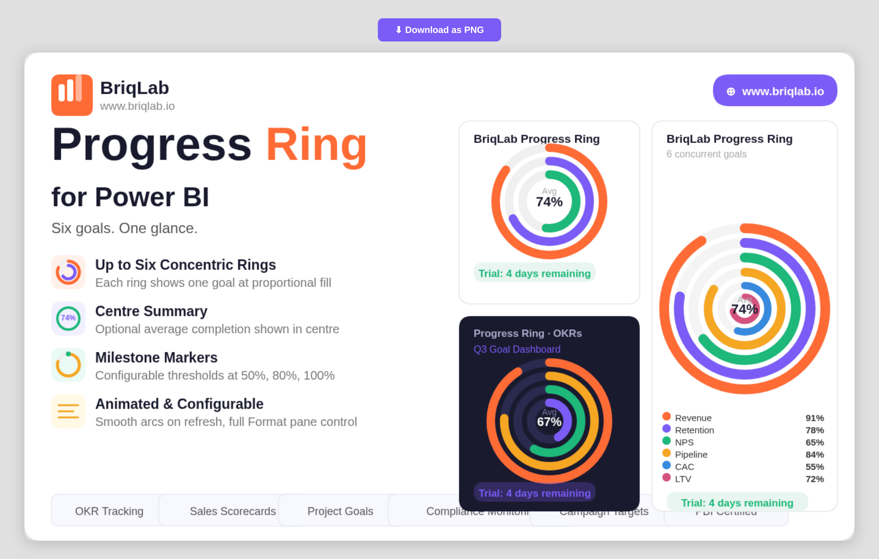
The Briqlab Progress Ring is a multi-ring progress chart for Power BI that displays up to six goals simultaneously as concentric, animated rings. Instead of stacking single gauges across a page, each metric becomes its own ring that fills proportionally to its percentage complete, so you can compare performance across several objectives in one compact, glanceable visual. The smooth animated arcs draw attention on every refresh, making it ideal for dashboards where multiple targets must stay visible side by side.
Key Features
- Displays up to six goals at once as concentric rings for instant multi-metric comparison
- Each ring fills proportionally to its percentage complete with a smooth animated arc
- Auto-colouring using the Briqlab brand palette, with manual per-ring colour overrides
- Optional centre summary showing the average completion percentage
- Milestone markers at configurable thresholds such as 50%, 80%, and 100%
- Outer labels showing each category name and value
- Fully configurable from the Format pane to match any report theme
- Certified Power BI custom visual with cross-filtering support
Top Use Cases
The Progress Ring is built for any team juggling several targets at once. It is a natural fit for OKR tracking, where each ring represents a key result moving toward 100%. Programme and project teams use it for multi-metric scorecards and departmental goal dashboards, showing sales, retention, and efficiency targets together. Operations and compliance leads rely on it for health-and-safety compliance monitoring, while marketing teams track concurrent campaign goals. Anywhere progress against several objectives must be communicated quickly to executives, the concentric layout keeps every goal in view.
Why Choose the Briqlab Progress Ring
Single-value gauges only tell part of the story; Briqlab Progress Ring consolidates up to six of them into one coherent visual, saving valuable dashboard space without losing clarity. The optional centre summary gives an immediate average-completion read, while configurable milestone markers add the reference points stakeholders look for. Auto-colouring from the unified Briqlab palette keeps rings on-brand by default, and manual overrides give designers full control. As a native Power BI custom visual, it animates on refresh, respects report themes, and participates in cross-filtering out of the box.