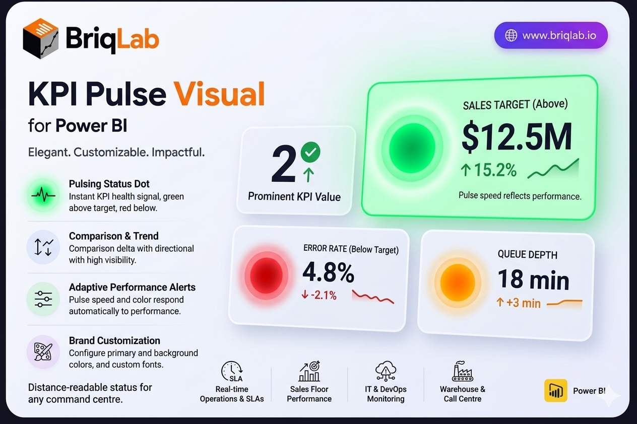
The Briqlab Pulse KPI is a Power BI Pulse KPI card that adds a living heartbeat to your dashboards. A pulsing status dot, green when the metric is above target and red when it falls below, communicates KPI health instantly, even from across a room. Alongside the dot, the card presents the current value, a comparison delta with a directional arrow, a mini trend indicator, and a configurable label. The pulse speed and colour respond automatically to performance, so status is never in doubt.
Key Features
- Pulsing status dot, green above target and red below, for instant health signals
- Current KPI value displayed prominently on the card
- Comparison delta with a directional arrow showing change
- Mini trend indicator for at-a-glance momentum
- Configurable text label to describe the metric
- Pulse animation speed and colour that respond to performance status
- Configurable primary colour and background colour
- Custom font selection from the Format pane
Top Use Cases
The Pulse KPI is built for environments where status matters more than fine detail. Real-time operations dashboards use it to flag SLA breaches, queue depth, or uptime, with the pulsing dot alerting teams the moment a metric turns red. Sales floor displays surface live quota and pipeline health to motivate teams. IT and DevOps monitoring screens track error rates, latency, and system health where an immediate red signal prompts action. It also suits warehouse, call centre, and command-centre walls where staff need to read KPI status from a distance.
Why Choose the Briqlab Pulse KPI
The Briqlab Pulse KPI turns a passive number into an active signal. The pulsing dot and adaptive animation respond automatically to whether the metric is above or below target, so dashboards communicate urgency without anyone reading the figure. The card still carries full context, including the value, comparison delta, directional arrow, and trend indicator, balancing alerting with detail. Primary colour, background, and font are all configurable in the Format pane to match your brand. As a native Power BI custom visual, it integrates cleanly with your reports and the interactions your teams already rely on.