Published
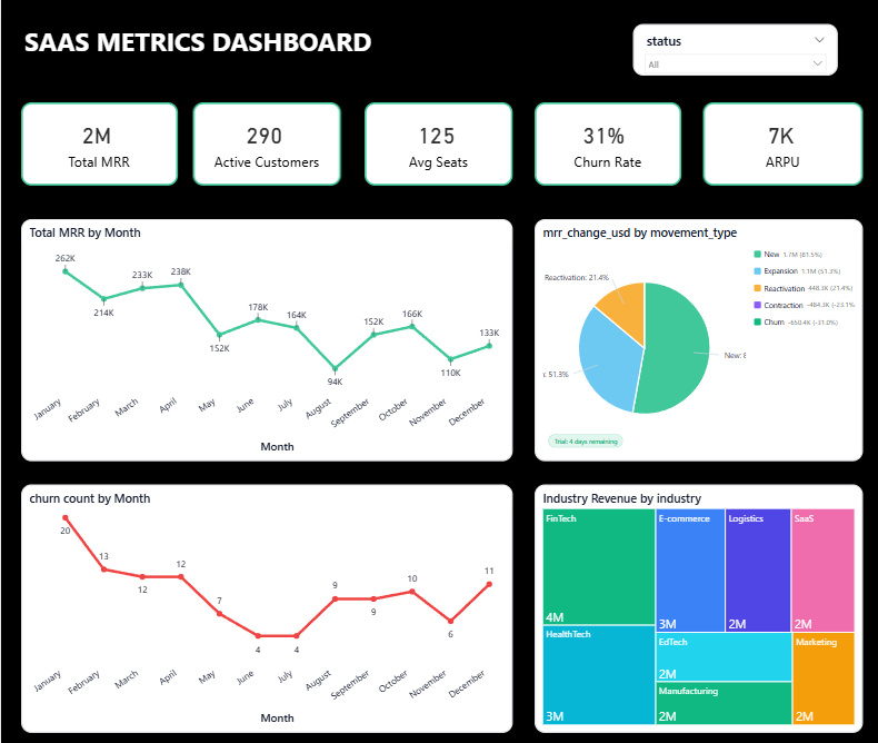
Summary: The Briqlab SaaS Metrics Dashboard is a modern Power BI analytics solution built to transform subscription and customer data into actionable business intelligence. It empowers startups, SaaS founders, and revenue teams to make faster, data-driven decisions with interactive and visually compelling analytics. Strategic Performance Metrics: Revenue Intelligence Track Total MRR, ARPU, and monthly revenue movement to monitor subscription growth and recurring revenue performance. Customer Analytics Analyze Active Customers, Average Seats, and churn metrics to understand customer retention and account expansion trends. Trend Monitoring Visualize month-over-month SaaS performance using dynamic line and area charts to identify growth spikes and engagement patterns. Industry Revenue Breakdown: Explore industry-wise revenue contribution using treemap visualizations to identify high-performing SaaS market segments. Interactive Filtering: Use smart slicers and responsive visual interactions to drill into specific customer groups, industries, or subscription statuses instantly. Make it Yours: Download this Briqlab SaaS Metrics Dashboard template to explore the complete Power BI architecture, KPI calculations, and DAX-driven analytics framework. Connect your own SaaS platform data, Stripe exports, CRM systems, or subscription datasets to instantly create a powerful revenue intelligence and customer analytics ecosystem tailored to your business.
Interactive Demo Available
Explore this dashboard live in Power BI
Category
Templates
Chart Types
Line, Tree Map / Hierarchical Chart, Donut
Industry Types
Finance
Main Colors
Green
Mode
dark
Version
Pro
PBIX File
🔑 Sign in to DownloadBuy this Dashboard