Published by Rasiga
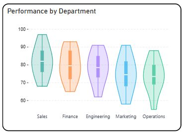
The Briqlab Violin Plot is an interactive visualization used to display the distribution and probability density of data across categories or groups. Each violin shape represents a category, with its width at any given point corresponding to the frequency of values in that range, making it easy to compare distributional patterns across multiple groups at a glance.
The chart combines the features of a box plot and a density plot, allowing users to simultaneously view the spread, median, interquartile range, and overall shape of the data distribution. This enables a more comprehensive understanding of how values are concentrated or spread within each category.
It features automatic colour assignment for clear group differentiation and supports symmetric density mirroring on both sides of the axis for improved readability. The visual also includes key statistical markers such as median lines and quartile ranges, allowing users to easily identify central tendencies and variability across different categories.
With its rich statistical design and intuitive shape-based encoding, the Violin Plot is effective for comparing distributions, detecting skewness or outliers, and understanding the underlying patterns within a dataset.