Published by Rasiga
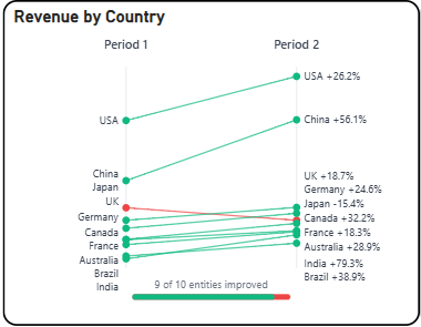
The Briqlab Slope Chart is an interactive visualization used to display the change in values between two or more time periods or categories. Each line represents a category or entity, with its slope corresponding to the direction and magnitude of change, making it easy to compare how different items have increased, decreased, or remained stable over time.
The chart highlights the relationship between starting and ending values through connected data points, allowing users to instantly identify trends, reversals, and relative shifts across categories. This enables a more focused understanding of how individual items have progressed or declined between defined comparison points.
It features automatic colour assignment for clear category differentiation and supports labelled endpoints on both sides for improved readability. The visual also includes positive and negative slope indicators, allowing users to easily distinguish between growth and decline across different categories at a glance.
With its clean and focused design, the Slope Chart is effective for comparing performance shifts, ranking changes, and directional trends, making it an ideal tool for identifying winners, losers, and key movers within a dataset.