Published by Rasiga
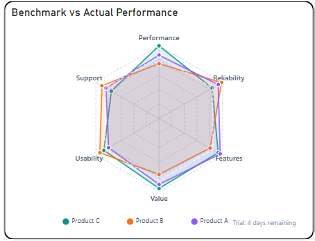
The Briqlab Radar Pro Chart is an interactive visualization used to display multivariate data across multiple dimensions or categories in a circular layout. Each axis represents a distinct metric or attribute, with its length corresponding to the value achieved in that dimension, making it easy to compare performance profiles across multiple variables at a glance.
The chart supports multi-series overlays, allowing users to plot and compare several categories or entities simultaneously on the same radar grid. This enables a more comprehensive understanding of how different groups perform across shared dimensions and where strengths or weaknesses are concentrated.
It features automatic colour assignment with transparent fill areas for clear series differentiation and supports labelled axis endpoints for improved readability. The visual also includes configurable gridlines and polygon overlays, allowing users to easily identify performance gaps, balanced profiles, and outlying dimensions across different categories.
With its circular and symmetrical design, the Radar Pro Chart is effective for performance benchmarking, skill assessment, competitive analysis, and identifying patterns across multiple attributes, making it an ideal tool for datasets that require simultaneous evaluation of several metrics within a single view.