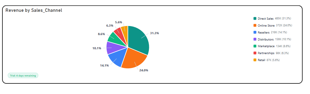
The Briqlab Pie Chart is a free Power BI custom visual built for analysts who need to communicate part-to-whole relationships clearly and immediately. Whether you are showing revenue split by product line, market share by region, or budget allocation by department, the visual turns proportional data into a story a non-technical stakeholder can read in seconds. Every slice is labelled automatically with its percentage, value, or both — no manual annotation required.
• Automatic percentage and value labelling — show one or both in a single label
• Donut mode with configurable inner radius for a cleaner, modern layout
• Explode-on-click slice emphasis for interactive presentation and storytelling
• Conditional colour formatting — rules-based slice colouring beyond fixed palettes
• Minimum slice threshold — small categories auto-grouped into an "Other" segment
• Interactive legend with click-to-hide individual slices
• Cross-filter and cross-highlight interaction with other report visuals
• Dark and light theme compatible with no extra setup
• Revenue breakdown — contribution by product line, region, or customer segment
• Market share analysis — brand or competitor share of a defined market
• Budget allocation — spend distribution across departments or cost centres
• Sales pipeline composition — deal count or value by stage or rep
• Survey results — response distribution across answer options