Published by Rasiga
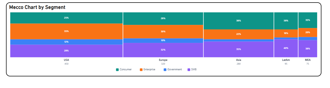
The Briqlab Mekko Chart is an interactive visualization used to display two-dimensional proportional data across categories and subcategories simultaneously. Each column represents a primary category, with its width corresponding to its share of the total value, while the height of each segment within the column represents the proportional breakdown of subcategories, making it easy to compare both category size and internal composition at a glance.
The chart supports dual-axis proportional encoding, allowing users to simultaneously analyse the relative weight of each primary category and the distribution of subcategories within it. This enables a more comprehensive understanding of how different segments contribute to both their parent category and the overall dataset.
It features automatic colour assignment for clear subcategory differentiation across all columns and supports labelled segments for improved readability of both values and percentages. The visual also includes interactive tooltips and hover highlights, allowing users to easily explore individual segment details and compare proportional contributions across different categories and subcategories.
With its two-dimensional and data-rich design, the Briqlab Mekko Chart is effective for market analysis, portfolio breakdown, competitive benchmarking, and compositional comparisons, making it an ideal tool for datasets that require simultaneous evaluation of both category size and internal distribution within a single unified view.