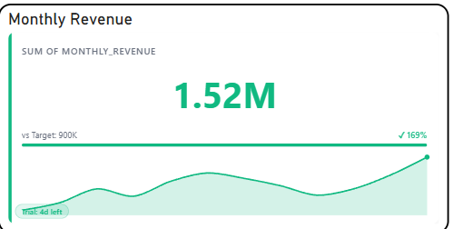
The Briqlab KPI Sparkline is a free Power BI custom visual for analysts who need to show both a current value and its recent trajectory in the same tile — without adding a second visual to the canvas. A compact inline trend line runs alongside the metric value, colour-coded automatically for positive or negative movement, with variance and percentage change displayed beneath.
• Inline sparkline trend line — historical trajectory displayed inside the KPI tile
• Automatic positive/negative colour-coding — configurable so up is good or bad per metric
• Variance indicator — absolute and percentage change vs prior period in the same tile
• Configurable target value — display current performance against a fixed or dynamic goal
• First and last value markers with optional min/max point highlighting on the trend line
• Area fill option beneath the sparkline for visual weight on dark-themed dashboards
• Supports currency, percentage, and custom number formats with prefix/suffix control
• Dark and light theme compatible with no extra setup
• Revenue tracking — current month value with a rolling 12-month trend line in one tile
• Sales pipeline — weekly deal volume with variance vs prior week and directional indicator
• SLA performance — compliance rate trend over the last 30 days alongside the current score
• Cost monitoring — spend trend with automatic red colouring when the direction is upward
• Marketing metrics — daily or weekly conversion rate with period-over-period percentage change