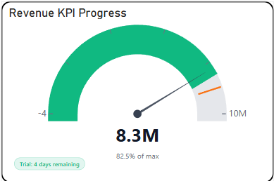
The Briqlab Gauge is a free Power BI custom visual for analysts and dashboard designers who need to communicate how close a metric is to its goal — instantly, without explanation. A needle points to the current value on a colour-coded arc divided into Poor, Satisfactory, and Optimal zones. A stakeholder who has never seen the report before understands the status in under two seconds..
• Multi-segment colour arc — Poor, Satisfactory, and Optimal zones with configurable boundaries per metric
• Precise needle positioning — renders at exact value, not rounded to the nearest zone
• Centre-value label — displays formatted value and metric name inside the arc
• Configurable min, max, and target — set independently per visual instance
• Animated needle transition on data refresh for live dashboard environments
• Supports percentage, currency, and custom number formats with prefix/suffix control
• Compact footprint — fits in narrow scorecard tiles alongside KPI cards
• Dark and light theme compatible with no extra setup
• SLA monitoring — compliance percentage against contractual thresholds in real time
• Budget consumption — spend as a percentage of allocation with an early-warning red zone
• Quota attainment — individual or team sales performance against monthly or quarterly target
• System health — server CPU, memory, or uptime percentage on operations dashboards
• Customer satisfaction — NPS or CSAT score vs target on executive and client-facing reports