Published by Rasiga
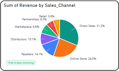
The Briqlab Pie Chart is an interactive visualization used to display the proportional distribution of data across a set of categories. Each segment of the pie represents a distinct category, with its size corresponding to its contribution to the total value, making it easy to compare the relative share of each component within the whole dataset at a glance.
The chart supports interactive segment highlighting, allowing users to hover or click on individual slices to view detailed value and percentage information for each category. This enables a more focused understanding of how individual components contribute to the overall distribution and total.
It features automatic colour assignment for clear category differentiation and supports outside labels with connector lines for improved readability across both large and small segments. The visual also includes smooth rendering animations and a configurable legend, allowing users to easily identify and distinguish between categories within the dataset.
With its simple yet effective circular design, the Briqlab Pie Chart is effective for analyzing part-to-whole relationships, comparing category shares, and communicating proportional data, making it an ideal tool for dashboards that require a clear and concise representation of distribution across multiple categories.