Published by Rasiga
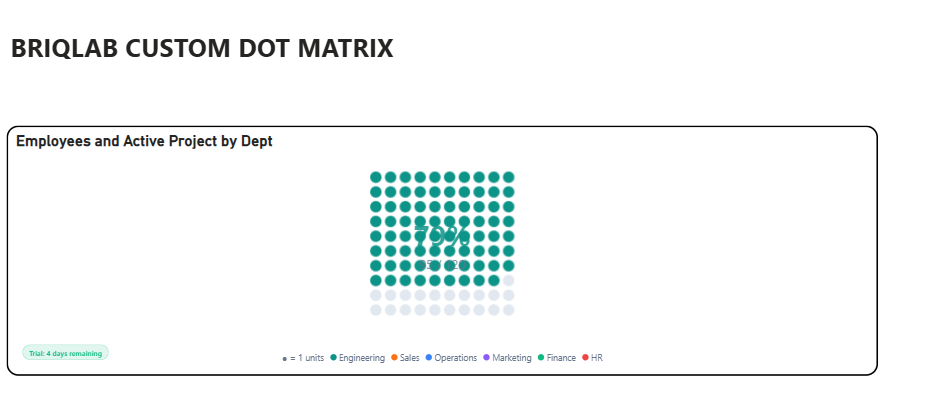
Briqlab Dot Matrix is an interactive visualization designed to represent proportional distribution across categories using a structured grid of uniform dots, where each dot represents a fixed unit of value. Through color-coded category grouping, users can quickly compare the relative share and contribution of each category within the total dataset.
The visual uses grid-based proportional encoding to provide an intuitive, countable representation of part-to-whole relationships, offering a compelling alternative to traditional percentage-based charts. Dot density and arrangement help users instantly perceive category dominance, distribution patterns, and comparative volumes.
It supports configurable dot sizes, grid layouts, automatic category color assignment, interactive tooltips, and category highlighting for deeper exploration of values and contributions.
Briqlab Dot Matrix is ideal for proportional analysis, category comparison, progress tracking, unit-based storytelling, and dashboards that require a clear and engaging representation of how individual categories contribute to the whole.