Published by Rasiga
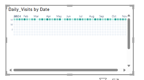
The Briqlab Calendar Heat Map is an interactive visualization used to display the distribution and intensity of data values across a calendar-based time period. Each cell represents a distinct day, week, or month, with its colour intensity corresponding to the magnitude of the value recorded during that period, making it easy to identify patterns, peaks, and low-activity periods across time at a glance.
The visual supports continuous colour gradient encoding, allowing users to instantly distinguish between high, moderate, and low value periods through a spectrum of shades ranging from light to dark. This enables a more intuitive understanding of temporal patterns, seasonal trends, and recurring cycles within the dataset.
It features automatic colour scaling for clear intensity differentiation across all calendar cells and supports configurable date ranges and period groupings for improved readability and contextual relevance. The visual also includes interactive tooltips and cell highlighting, allowing users to hover over individual dates to explore precise values and compare activity levels across different time periods.
With its time-based and pattern-driven design, the Briqlab Calendar Heat Map is effective for tracking daily performance, identifying seasonal trends, monitoring activity cycles, and visualizing time-series data, making it an ideal tool for dashboards that require a comprehensive and calendar-aligned view of value distribution over time.