Published by Rasiga
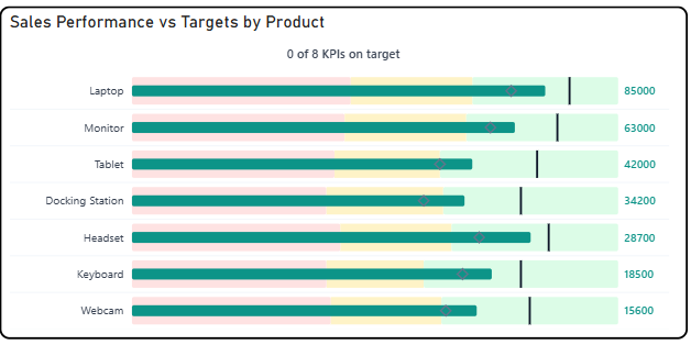
The Briqlab Bullet Pro Chart is an interactive visualization used to display actual sales performance relative to predefined thresholds and targets across multiple categories. Each bar represents a product or category, with its length corresponding to the actual value achieved, making it easy to compare performance at a glance.
The chart features a multi-zone background system, dividing each row into Poor, Satisfactory, and Good performance bands, allowing users to instantly understand where actual performance falls within the acceptable range. A vertical target marker line is overlaid on each bar to indicate the goal value, providing a clear visual reference for success.
It supports outside value labels for precise data readability and uses distinct colour coding for each performance zone to enable quick identification of underperforming or overperforming categories. The visual also includes a KPI summary indicator at the top, showing how many categories are meeting their targets at a glance.
With its structured layout and performance-zone design, the Bullet Pro Chart is effective for tracking goal attainment, benchmarking performance, and identifying categories that require attention within a dataset.