The Briqlab Bar Chart is a free Power BI custom visual for analysts and report designers who have hit the formatting ceiling of Power BI's native bar chart and need more — more visual polish, more label intelligence, more hierarchy depth — without rebuilding their report from scratch. It supports both vertical column and horizontal bar orientations, renders grow animations on load that make dashboards feel alive rather than static, and formats data labels automatically in K and M notation.
• Vertical and horizontal orientation — column and bar modes in a single visual with one toggle
• Rounded corner aesthetics — configurable corner radius from sharp to fully pill-shaped per design preference
• Smooth grow animations — bars animate in on load and on filter change for a polished dashboard feel
• Automatic K/M label formatting — magnitude-aware abbreviation without manual DAX formatting measures
• Interactive drill-down — direct bar click navigates hierarchy levels with breadcrumb trail navigation
• Reference lines — target and average overlays configurable per visual instance
• Cross-filter interaction with other visuals on the report page
• Dark and light theme compatible with no extra setup
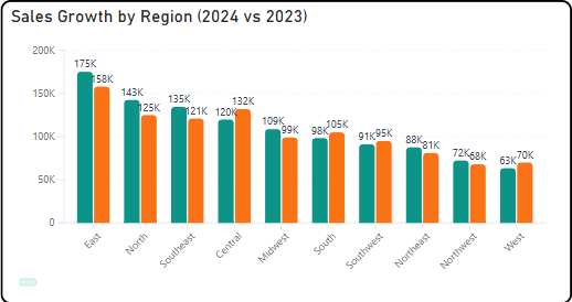
• Regional sales comparison — territory performance ranked horizontally with drill-down from region to country to city on bar click
• Budget vs actual reporting — department spend compared against plan with K/M labels that stay readable at any data magnitude
• Product category performance — vertical column chart with grow animation for live presentation and client-facing dashboards
• Campaign channel comparison — marketing spend and return by channel with reference line marking the portfolio average
• Headcount by department — horizontal bar layout with long department name labels that fit cleanly in a wide left axis