Published by Rasiga
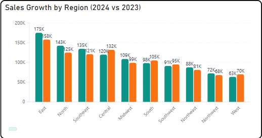
Briqlab Bar chart is designed to provide clear and flexible data visualization with a modern user experience. It supports both vertical and horizontal orientations, allowing users to switch views easily through the format pane.
Users can click on any bar to drill down into subcategories, enabling deeper analysis using the available data hierarchy. The visual also supports cross-filtering, meaning selections automatically update and interact with other visuals on the Power BI report page.
The design includes rounded bar corners and a modern visual style, enhancing readability and aesthetics. Optional data labels with K/M formatting provide quick insights into values without cluttering the chart.
Additionally, a rich hover tooltip displays detailed information for each data point, and a smooth grow-from-bottom animation improves the visual experience when the chart loads.